Custom visualization of sports data in Tableau
⏱ Время чтения текста – 8 минутBeing a tennis fan, I recently discovered a new app created to help players to assess their game skills – SwingVision. The app can recognize tennis shots in real-time and display its landing coordinates. The author of this app is Swupnil Sahai, currently he is a Lecturer at UC Berkley.

SwingVision also allows you to view your “rallies” and specific shots, assess the average shot speed and error rate. Moreover one can easily export its stats as an Excel Table.

In today’s material, we are going to create a custom Tableau chart that would reproduce stats from SwingVision and display the landing location of my shots on the court. First, we need to find a suitable tennis court image (top view), like this one.
Next, we need to import the data stored as an Excel Table into Tableau, set values for both coordinates using the Shot Placement (x), and Shot Placement (y) columns, and remove the aggregation of measures to get something like this:

After filtering shots by player the chart somewhat resembles the upside-down version of the actual image:

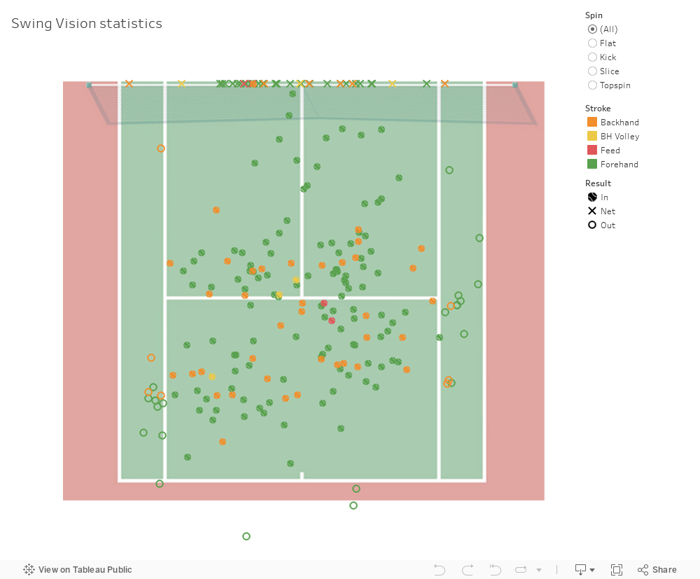
To reverse the image, we need to change the values of current x and y from positive to negative by creating new measures, add some color and everything will start to line up:

The X marks on the chart represent all shots that hit the net, we can hide them from view and set a constant value for Y =- 11,89, which corresponds to the length of a half-court.
Then when we try adding the background image, however, this will cause a warning, because the image is not scaled properly:


This means that we need to calculate the ratio of our image to the real-size court. In our case, for instance, the image is 913px in width, while the court itself is 10.97 meters wide, so by calculating 913 over 10.97, the ratio for x will be 83.227.

The middle of the court will be considered as the origin (0, 0), and will divide the court vertically into halves of 456.5px.
Remember that the image itself has margins, both to the right and left that are equal to 143.3px each. Just create new measures for x and y, substituting with the following values:


After these steps, our image should be as follows:

As finishing touches, we set a custom icon for each point on the chart and add filtering options.
To sum up, the dashboard displays everything we need: landing location of shots, their speed, types of strokes and expanded tooltip info on hover: