6 posts tagged

dash

How to build a dashboard with Bootstrap 4 from scratch (Part 2)

Время чтения текста – 12 минут

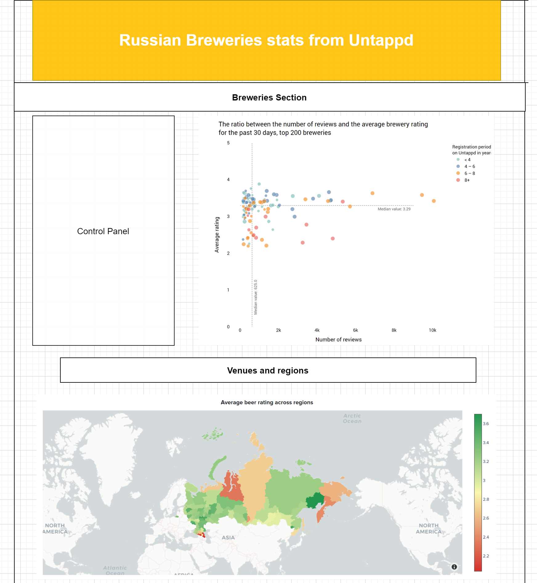
Previously we shared how to use Bootstrap components in building dashboard layout and designed a simple yet flexible dashboard with a scatter plot and Russian map. In today’s material, we will continue adding more information, explore how to make Bootstrap tables responsive, and cover some complex callbacks for data acquisition.

Constructing Data Tables

All the code for populating our tables with data will be stored in get_tables.py , while the layout components areoutlined in  application.py. This article will cover the process of creating the table with top Russian Breweries, however, you can find the code for creating the other three on Github.

Data in the Top Breweries table can be filtered by city name in the dropdown menu, but the data collected in Untappd is not equally structured. Some city names are written in Latin, others in Cyrillic. So the challenge is to make the names equal for SQL queries, and here is where Google Translate comes to the rescue. Though we sill have to manually create a dictionary of city names, since for example “Москва” can be written as “Moskva” and not “Moscow”. This dictionary will be used later for mapping our DataFrame before transforming it into a Bootstrap table.

import pandas as pd
import dash_bootstrap_components as dbc
from clickhouse_driver import Client
import numpy as np
from googletrans import Translator

translator = Translator()

client = Client(host='12.34.56.78', user='default', password='', port='9000', database='')

city_names = {
   'Moskva': 'Москва',
   'Moscow': 'Москва',
   'СПБ': 'Санкт-Петербург',
   'Saint Petersburg': 'Санкт-Петербург',
   'St Petersburg': 'Санкт-Петербург',
   'Nizhnij Novgorod': 'Нижний Новгород',
   'Tula': 'Тула',
   'Nizhniy Novgorod': 'Нижний Новгород',
}

Top Breweries Table

This table displays top 10 Russian breweries and their position change according to the rating. Simply put, we need to compare data for two periods, that’s [30 days ago; today] and [60 days ago; 30 days ago]. With this in mind, we will need the following headers: ranking, brewery name, position change, and number of check-ins.
Create the  get_top_russian_breweries function that would make queries to the Clickhouse DB, sort the data and return a refined Pandas DataFrame. Let’s send the following queries to obtain data for the past 30 and 60 days, ordering the results by the number of check-ins.


Querying data from the Database

def get_top_russian_breweries(checkins_n=250):
   top_n_brewery_today = client.execute(f'''
      SELECT  rt.brewery_id,
              rt.brewery_name,
              beer_pure_average_mult_count/count_for_that_brewery as avg_rating,
              count_for_that_brewery as checkins FROM (
      SELECT           
              brewery_id,
              dictGet('breweries', 'brewery_name', toUInt64(brewery_id)) as brewery_name,
              sum(rating_score) AS beer_pure_average_mult_count,
              count(rating_score) AS count_for_that_brewery
          FROM beer_reviews t1
          ANY LEFT JOIN venues AS t2 ON t1.venue_id = t2.venue_id
          WHERE isNotNull(venue_id) AND (created_at >= (today() - 30)) AND (venue_country = 'Россия') 
          GROUP BY           
              brewery_id,
              brewery_name) rt
      WHERE (checkins>={checkins_n})
      ORDER BY avg_rating DESC
      LIMIT 10
      '''
   )

top_n_brewery_n_days = client.execute(f'''
  SELECT  rt.brewery_id,
          rt.brewery_name,
          beer_pure_average_mult_count/count_for_that_brewery as avg_rating,
          count_for_that_brewery as checkins FROM (
  SELECT           
          brewery_id,
          dictGet('breweries', 'brewery_name', toUInt64(brewery_id)) as brewery_name,
          sum(rating_score) AS beer_pure_average_mult_count,
          count(rating_score) AS count_for_that_brewery
      FROM beer_reviews t1
      ANY LEFT JOIN venues AS t2 ON t1.venue_id = t2.venue_id
      WHERE isNotNull(venue_id) AND (created_at >= (today() - 60) AND created_at <= (today() - 30)) AND (venue_country = 'Россия')
      GROUP BY           
          brewery_id,
          brewery_name) rt
  WHERE (checkins>={checkins_n})
  ORDER BY avg_rating DESC
  LIMIT 10
  '''
)

Creating two DataFrames with the received data:

top_n = len(top_n_brewery_today)
column_names = ['brewery_id', 'brewery_name', 'avg_rating', 'checkins']

top_n_brewery_today_df = pd.DataFrame(top_n_brewery_today, columns=column_names).replace(np.nan, 0)
top_n_brewery_today_df['brewery_pure_average'] = round(top_n_brewery_today_df.avg_rating, 2)
top_n_brewery_today_df['brewery_rank'] = list(range(1, top_n + 1))

top_n_brewery_n_days = pd.DataFrame(top_n_brewery_n_days, columns=column_names).replace(np.nan, 0)
top_n_brewery_n_days['brewery_pure_average'] = round(top_n_brewery_n_days.avg_rating, 2)
top_n_brewery_n_days['brewery_rank'] = list(range(1, len(top_n_brewery_n_days) + 1))

And then calculate the position change over the period of time for each brewery received. With the try-except block, we will handle exceptions, in case, if a brewery was not yet in our database 60 days ago.

rank_was_list = []
for brewery_id in top_n_brewery_today_df.brewery_id:
   try:
       rank_was_list.append(
           top_n_brewery_n_days[top_n_brewery_n_days.brewery_id == brewery_id].brewery_rank.item())
   except ValueError:
       rank_was_list.append('–')
top_n_brewery_today_df['rank_was'] = rank_was_list

Now we iterate over the columns with current and former positions. If there is no hyphen contained in, we will append an up or down arrow depending on the change.

diff_rank_list = []
for rank_was, rank_now in zip(top_n_brewery_today_df['rank_was'], top_n_brewery_today_df['brewery_rank']):
   if rank_was != '–':
       difference = rank_was - rank_now
       if difference > 0:
           diff_rank_list.append(f'↑ +{difference}')
       elif difference < 0:
           diff_rank_list.append(f'↓ {difference}')
       else:
           diff_rank_list.append('–')
   else:
       diff_rank_list.append(rank_was)

Finally, replace DataFrame headers, inserting the column with current ranking positions, where the top 3 will be displayed with the trophy emoji.

df = top_n_brewery_today_df[['brewery_name', 'avg_rating', 'checkins']].round(2)
df.insert(2, 'Position change', diff_rank_list)
df.columns = ['NAME', 'RATING', 'POSITION CHANGE', 'CHECK-INS']
df.insert(0, 'RANKING', list('🏆 ' + str(i) if i in [1, 2, 3] else str(i) for i in range(1, len(df) + 1)))

return df

Filtering data by city name

One of the main tasks we set before creating this dashboard was to find out what are the most liked breweries in a certain city. The user chooses a city in the dropdown menu and gets the results. Sound pretty simple, but is it that easy?
Our next step is to write a script that would update data for each city and store it in separate CSV files. As we mentioned earlier, the city names are not equally structured, so we need to use Google Translator within the if-else block, and since it may not convert some names to Cyrillic we need to explicitly specify such cases:

en_city = venue_city
if en_city == 'Nizhnij Novgorod':
      ru_city = 'Нижний Новгород'
elif en_city == 'Perm':
      ru_city = 'Пермь'
elif en_city == 'Sergiev Posad':
      ru_city = 'Сергиев Посад'
elif en_city == 'Vladimir':
      ru_city = 'Владимир'
elif en_city == 'Yaroslavl':
      ru_city = 'Ярославль'
else:
      ru_city = translator.translate(en_city, dest='ru').text

Then we need to add both city names in English and Russian to the SQL query, to receive all check-ins sent from this city.

WHERE (rt.venue_city='{ru_city}' OR rt.venue_city='{en_city}')

Finally, we export received data into a CSV file in the following directory – data/cities.

df = top_n_brewery_today_df[['brewery_name', 'venue_city', 'avg_rating', 'checkins']].round(2)
df.insert(3, 'Position Change', diff_rank_list)
df.columns = ['NAME', 'CITY', 'RATING', 'POSITION CHANGE', 'CHECK-INS']
# MAPPING
df['CITY'] = df['CITY'].map(lambda x: city_names[x] if (x in city_names) else x)
# TRANSLATING
df['CITY'] = df['CITY'].map(lambda x: translator.translate(x, dest='en').text)
df.to_csv(f'data/cities/{en_city}.csv', index=False)
print(f'{en_city}.csv updated!')

Scheduling Updates

We will use the apscheduler library to automatically run the script and refresh data for each city in all_cities every day at 10:30 am (UTC).

from apscheduler.schedulers.background import BackgroundScheduler
from get_tables import update_best_breweries

all_cities = sorted(['Vladimir', 'Voronezh', 'Ekaterinburg', 'Kazan', 'Red Pakhra', 'Krasnodar',
             'Kursk', 'Moscow', 'Nizhnij Novgorod', 'Perm', 'Rostov-on-Don', 'Saint Petersburg',
             'Sergiev Posad', 'Tula', 'Yaroslavl'])

scheduler = BackgroundScheduler()
@scheduler.scheduled_job('cron', hour=10, misfire_grace_time=30)
def update_data():
   for city in all_cities:
       update_best_breweries(city)
scheduler.start()

Table from DataFrame

get_top_russian_breweries_table(venue_city, checkins_n=250)  will accept venue_city and checkins_n generating a Bootstrap Table with the top breweries. The second parameter value, checkins_n can be changed with the slider. If the city name is not specified, the function will return top Russian breweries table.

if venue_city == None: 
      selected_df = get_top_russian_breweries(checkins_n)
else: 
      en_city = venue_city

In other case the DataFrame will be constructed from a CSV file stored in data/cities/. Since the city column still may contain different names we should apply mapping and use a lambda expression with the map() method. The lambda function will compare values in the column against keys in city_names and if there is a match, the column value will be overwritten.
For instance, if df[‘CITY’] contains “СПБ”, a frequent acronym for Saint Petersburg, the value will be replaced, while for “Воронеж” it will remain unchanged.
And last but not least, we need to remove all duplicate rows from the table, add a column with a ranking position and return the first 10 rows. These would be the most liked breweries in a selected city.

df = pd.read_csv(f'data/cities/{en_city}.csv')     
df = df.loc[df['CHECK-INS'] >= checkins_n]
df.drop_duplicates(subset=['NAME', 'CITY'], keep='first', inplace=True)  
df.insert(0, 'RANKING', list('🏆 ' + str(i) if i in [1, 2, 3] else str(i) for i in range(1, len(df) + 1)))
selected_df = df.head(10)

After all DataFrame manipulations, the function returns a simply styled Bootstrap table of top breweries.


Bootstrap table layout in DBC

table = dbc.Table.from_dataframe(selected_df, striped=False,
                                bordered=False, hover=True,
                                size='sm',
                                style={'background-color': '#ffffff',
                                       'font-family': 'Proxima Nova Regular',
                                       'text-align':'center',
                                       'fontSize': '12px'},
                                className='table borderless'
                                )

return table

Layout structure

Add a Slider and a Dropdown menu with city names in application.py

To learn more about the Dashboard layout structure, please refer to our previous guide

checkins_slider_tab_1 = dbc.CardBody(
                           dbc.FormGroup(
                               [
                                   html.H6('Number of check-ins', style={'text-align': 'center'})),
                                   dcc.Slider(
                                       id='checkin_n_tab_1',
                                       min=0,
                                       max=250,
                                       step=25,
                                       value=250,  
                                       loading_state={'is_loading': True},
                                       marks={i: i for i in list(range(0, 251, 25))}
                                   ),
                               ],
                           ),
                           style={'max-height': '80px', 
                                  'padding-top': '25px'
                                  }
                       )

top_breweries = dbc.Card(
       [
           dbc.CardBody(
               [
                   dbc.FormGroup(
                       [
                           html.H6('Filter by city', style={'text-align': 'center'}),
                           dcc.Dropdown(
                               id='city_menu',
                               options=[{'label': i, 'value': i} for i in all_cities],
                               multi=False,
                               placeholder='Select city',
                               style={'font-family': 'Proxima Nova Regular'}
                           ),
                       ],
                   ),
                   html.P(id="tab-1-content", className="card-text"),
               ],
           ),
   ],
)

We’ll also need to add a callback function to update the table by dropdown menu and slider values:

@app.callback(
   Output("tab-1-content", "children"), [Input("city_menu", "value"),
                                         Input("checkin_n_tab_1", "value")]
)
def table_content(city, checkin_n):
   return get_top_russian_breweries_table(city, checkin_n)

Tada, the main table is ready! The dashboard can be used to receive up-to-date info about best Russian breweries, beers, and its rating across different regions, and help to make a better choice for an enjoyable tasting experience.

View the code on GitHub

 No comments    628   2020   BI-tools   bootstrap   dash   plotly   python

How to build a dashboard with Bootstrap 4 from scratch (Part 1)

Время чтения текста – 13 минут

In previous articles we reviewed Plotly’s Dash Framework, learned to build scatter plots and  create a map visualization. This time we will summarize our knowledge and put all the pieces together to design a dashboard layout using the Bootstrap 4 grid system.
To facilitate the development, we’ll refer to the dash-bootstrap-components library. This is a great tool that integrates Bootstrap in Dash, allowing us to write web pages in pure Python, and add any Bootstrap components and styling.

Draft Layout

Before we begin coding it’s crucial to have a plan of our app, a rough layout that would help us to see the big picture and quickly modify the structure. We used draw.io to make a dashboard draft, this application enables to create diagrams, graphs, flowcharts, and forms at the click of a button. The dashboard will be built according to this template:

Like the dashboard itself, the top header will be colored in gold and white, the main colors of Untappd. Just below the header, there is a section with breweries, which includes a scatter plot and a control panel. And at the bottom of the page, there will be a map showing beverage rating across the regions of Russia.

All right, let’s get started, first create a new python file with the name application.py. The file will store all the front end components of the dashboard, and create a new directory named assets. The directory structure should be similar:

- application.py
- assets/
    |-- typography.css
    |-- header.css
    |-- custom-script.js
    |-- image.png

Then we import the libraries and initialize our application:

import dash
import dash_bootstrap_components as dbc
import dash_html_components as html
import dash_core_components as dcc
import pandas as pd
from get_ratio_scatter_plot import get_plot
from get_russian_map import get_map
from clickhouse_driver import Client
from dash.dependencies import Input, Output

standard_BS = dbc.themes.BOOTSTRAP
app = dash.Dash(__name__, external_stylesheets=[standard_BS])

Main parameters of the app:
__name__ — to enable access to static elements stored in the assets folder (such as images, CSS and JS files)
external_stylesheets — external CSS styling, here we are using a standard Bootstrap theme, however you can create your own theme or use any of  the availables ones.

Hook up a few more things to work with local files and connect to the Clickhouse Database:

app.scripts.config.serve_locally = True
app.css.config.serve_locally = True

client = Client(host='ec2-3-16-148-63.us-east-2.compute.amazonaws.com',
                user='default',
                password='',
                port='9000',
                database='default')

Add a palette of colors:

colors = ['#ffcc00', 
          '#f5f2e8', 
          '#f8f3e3',
          '#ffffff', 
          ]

Creating a layout

All the dashboard elements will be placed within a Bootstrap container, which is in the  <div> block:

- app 
    |-- div
     |-- container
      |-- logo&header
     |-- container
      |-- div
       |-- controls&scatter
       |-- map
app.layout = html.Div(
                    [
                        dbc.Container(

                                         < header>
                         
                        dbc.Container(       
                            html.Div(
                                [
                        
                                    < body >
                        
                                ],
                            ),
                            fluid=False, style={'max-width': '1300px'},
                        ),
                    ],
                    style={'background-color': colors[1], 'font-family': 'Proxima Nova Bold'},
                )

Here we set a fixed container width, background color, and font style of the page that is stored in typography.css in the assets folder. Let’s take a closer look at the first element in the div block, that’s the top header with the Untappd logo:

logo = html.Img(src=app.get_asset_url('logo.png'),
                        style={'width': "128px", 'height': "128px",
                        }, className='inline-image')

and the header:

header = html.H3("Russian breweries stats from Untappd", style={'text-transform': "uppercase"})

We used Bootstrap Forms to position these two elements on the same level.

logo_and_header = dbc.FormGroup(
        [
            logo,
            html.Div(
                [
                    header
                ],
                className="p-5"
            )
        ],
        className='form-row',
)

The class name ‘p-5’ allows to increase padding and vertically align the title while specifying ‘form-row’ as the form class name we put the logo and header in one row. At this point, the top header should look the following:

Now we need to center the elements and add some colors. Create a separate container that will take one row. Specify ‘d-flex justify-content-center’ in the className to achieve the same output.

dbc.Container(
                    dbc.Row(
                        [
                            dbc.Col(
                                html.Div(
                                    logo_and_header,
                                ),
                            ),
                        ],
                        style={'max-height': '128px',
                               'color': 'white',
                       }

                    ),
                    className='d-flex justify-content-center',
                    style={'max-width': '100%',
                           'background-color': colors[0]},
                ),

And now the top header is done:

We’re approaching the main part, create the next Bootstrap Container and add a subheading:

dbc.Container(
                    html.Div(
                        [
                            html.Br(),
                            html.H5("Breweries", style={'text-align':'center', 'text-transform': 'uppercase'}),
                            html.Hr(), # horizontal  break

The main body will consist of Bootstrap Cards, they can provide a structured layout of all parts, giving each element a clear border and saving the white space. Create the next element, a control panel with sliders:

slider_day_values = [1, 10, 20, 30, 40, 50, 60, 70, 80, 90, 100]
slider_top_breweries_values = [5, 25, 50, 75, 100, 125, 150, 175, 200]

controls = dbc.Card(
    [
       dbc.CardBody(
           [
               dbc.FormGroup(
                    [
                        dbc.Label("Time Period", style={'text-align': 'center', 'font-size': '100%', 'text-transform': 'uppercase'}),
                        dcc.Slider(
                            id='slider-day',
                            min=1,
                            max=100,
                            step=10,
                            value=100,
                            marks={i: i for i in slider_day_values}
                        ),
                    ], style={'text-align': 'center'}
               ),
               dbc.FormGroup(
                    [
                        dbc.Label("Number of breweries", style={'text-align': 'center', 'font-size': '100%', 'text-transform': 'uppercase'}),
                        dcc.Slider(
                            id='slider-top-breweries',
                            min=5,
                            max=200,
                            step=5,
                            value=200,
                            marks={i: i for i in slider_top_breweries_values}
                        ),
                    ], style={'text-align': 'center'}
               ),
           ],
       )
    ],
    style={'height': '32.7rem', 'background-color': colors[3]}
)

The control panel consists of two sliders that can be used to change the view on the scatter, they are positioned one below the other in a Bootstrap Form. The sliders were put inside the dbc.CardBody block, other elements will be added in the same way. It allows to eliminate alignment problem and achieve clear borders. By default, the sliders are painted in blue, but we can easily customize them by changing the properties of the class in sliders.css. Add the control panel with the scatter plot as follows:

dbc.Row(
                [
                    dbc.Col(controls, width={"size": 4,
                                     "order": 'first',
                                             "offset": 0},
                     ),
                     dbc.Col(dbc.Card(
                                [
                                    dbc.CardBody(
                                        [
                                            html.H6("The ratio between the number of reviews and the average brewery rating",
                                                    className="card-title",
                                                    style={'text-transform': 'uppercase'}), 
                                            dcc.Graph(id='ratio-scatter-plot'),
                                        ],
                                    ),
                                ],
                                style={'background-color': colors[2], 'text-align':'center'}
                             ),
                     md=8),
                ],
                align="start",
                justify='center',
            ),
html.Br(),

And at the bottom of the page we will position the map:

html.H5("Venues and Regions", style={'text-align':'center', 'text-transform': 'uppercase',}),
                            html.Hr(), # horizontal  break
                            dbc.Row(
                                [
                                    dbc.Col(
                                        dbc.Card(
                                            [
                                                dbc.CardBody(
                                                    [
                                                        html.H6("Average beer rating across regions",
                                                                className="card-title",
                                                                style={'text-transform': 'uppercase'},
                                                        ),  
                                                        dcc.Graph(figure=get_map())
                                                    ],
                                                ),
                                            ],
                                        style={'background-color': colors[2], 'text-align': 'center'}
                                        ),
                                md=12),
                                ]
                            ),
                            html.Br(),

Callbacks in Dash

Callback functions allow making dashboard elements interactive through the  Input and Output properties of a particular component.

@app.callback(
    Output('ratio-scatter-plot', 'figure'),
    [Input('slider-day', 'value'),
     Input('slider-top-breweries', 'value'),
     ]
)
def get_scatter_plots(n_days=100, top_n=200):
    if n_days == 100 and top_n == 200:
        df = pd.read_csv('data/ratio_scatter_plot.csv')
        return get_plot(n_days, top_n, df)
    else:
        return get_plot(n_days, top_n)

In this example, our inputs are the “value” properties of the components that have the ids “slider-day’” and  “slider-top-breweries”. Our output is the “children” property of the component with the id “ratio-scatter-plot”. When the input values are changed, the decorator function will be called automatically and the output on the scatter is updated. Learn more about callbacks from the examples in the docs.
It’s worth noting, that the scatter plot may not be displayed correctly when the page is loaded. To avoid this scenario we need to specify its initial state and produce a scatter plot from the saved CSV file stored in the data folder. Then, when changing the slider values, all data will be taken directly from the Clickhouse tables.

Add a few more lines responsible for deployment and our app is ready to run:

application = app.server

if __name__ == '__main__':
    application.run(debug=True, port=8000)

Next, we need to  deploy our app to AWS BeansTalk and the first part of our Bootstrap Dashboard is completed:

Thanks for reading the first part of our series about Bootstrap Dashboards, in the next one we are going to add more new components, improved callbacks, and talk about tables in Bootstrap.

View the code on Github

 No comments    1325   2020   bootstrap   dash   data analytics   untappd

VIsualizing COVID-19 in Russia with Plotly

Время чтения текста – 9 минут

Maps are widely used in data visualization, it’s a great tool to display statistics for certain areas, regions, and cities. Before displaying the map we need to encode each region or any other administrative unit. Choropleth map gets divided into polygons and multipolygons with latitude and longitude coordinates. Plotly has a built-in solution for plotting choropleth map for America and Europe regions, however, Russia is not included yet. So we decided to use an existing GeoJSON file to map administrative regions of Russia and display the latest COVID-19 stats with Plotly.

from urllib.request import urlopen
import json
import requests
import pandas as pd
from selenium import webdriver
from bs4 import BeautifulSoup as bs
import plotly.graph_objects as go

Modifying GeoJSON

First, we need to download a public GeoJSON file with the boundaries for the Federal subjects of Russia. The file already contains some information, such as region names, but it’s still doesn’t fit the required format and missing region identifiers.

with urlopen('https://raw.githubusercontent.com/codeforamerica/click_that_hood/master/public/data/russia.geojson') as response:
    counties = json.load(response)

Besides that, there are slight differences in the namings. For example, Bashkortostan on стопкоронавирус.рф, the site we are going to scrape data from, it’s listed as “The Republic of Bashkortostan”, while in our GeoJSON file it’s simply named “Bashkortostan”. These differences should be eliminated to avoid possible confusion. Also, the names should start with a capital.

regions_republic_1 = ['Бурятия', 'Тыва', 'Адыгея', 'Татарстан', 'Марий Эл',
                      'Чувашия', 'Северная Осетия – Алания', 'Алтай',
                      'Дагестан', 'Ингушетия', 'Башкортостан']
regions_republic_2 = ['Удмуртская республика', 'Кабардино-Балкарская республика',
                      'Карачаево-Черкесская республика', 'Чеченская республика']
for k in range(len(counties['features'])):
    counties['features'][k]['id'] = k
    if counties['features'][k]['properties']['name'] in regions_republic_1:
        counties['features'][k]['properties']['name'] = 'Республика ' + counties['features'][k]['properties']['name']
    elif counties['features'][k]['properties']['name'] == 'Ханты-Мансийский автономный округ - Югра':
        counties['features'][k]['properties']['name'] = 'Ханты-Мансийский АО'
    elif counties['features'][k]['properties']['name'] in regions_republic_2:
        counties['features'][k]['properties']['name'] = counties['features'][k]['properties']['name'].title()

It’s time to create a DataFrame from the resulting GeoJSON file with the regions of Russia, we’ll take the identifiers and names.

region_id_list = []
regions_list = []
for k in range(len(counties['features'])):
    region_id_list.append(counties['features'][k]['id'])
    regions_list.append(counties['features'][k]['properties']['name'])
df_regions = pd.DataFrame()
df_regions['region_id'] = region_id_list
df_regions['region_name'] = regions_list

As a result, our DataFrame looks like the following:

Data Scraping

We need to scrape the data stored in this table:

Let’s use the Selenium library for this task. We need to navigate to the webpage and convert it into a BeautifulSoup object

driver = webdriver.Chrome()
driver.get('https://стопкоронавирус.рф/information/')
source_data = driver.page_source
soup = bs(source_data, 'lxml')

The region names are wrapped with <th> tags, while the latest data is stored in table cells, each one is defined with a <td> tag.

divs_data = soup.find_all('td')

The divs_data list should return something like this:

The data is grouped in one line, this includes both new cases and active ones. It is noticeable that each region corresponds to five values, for Moscow these are the first five, for Moscow Region the next five and so on. We can use this pattern to create five lists and populate with values according to the index. The first value will be appended to the list with active cases, the second value to the list of new ones, etc. After every five values, the index will be reset to zero.

count = 1
for td in divs_data:
    if count == 1:
        sick_list.append(int(td.text))
    elif count == 2:
        new_list.append(int(td.text))
    elif count == 3:
        cases_list.append(int(td.text))
    elif count == 4:
        healed_list.append(int(td.text))
    elif count == 5:
        died_list.append(int(td.text))
        count = 0
    count += 1

The next step is to extract the region names from the table, they are stored within the col-region class. We also need to clean up the data by eliminating extra white spaces and line breaks.

divs_region_names = soup.find_all('th', {'class':'col-region'})
region_names_list = []
for i in range(1, len(divs_region_names)):
    region_name = divs_region_names[i].text
    region_name = region_name.replace('\n', '').replace('  ', '')
    region_names_list.append(region_name)

Create a DataFrame:

df = pd.DataFrame()
df['region_name'] = region_names_list
df['sick'] = sick_list
df['new'] = new_list
df['cases'] = cases_list
df['healed'] = healed_list
df['died'] = died_list

After reviewing our data once again we detected white space under the index 10. This should be fixed immediately, otherwise, we may run into problems.

df.loc[10, 'region_name'] = df[df.region_name == 'Челябинская область '].region_name.item().strip(' ')

Finally, we can merge our DataFrame on the region_name column, so that the resulted table will include a column with region id, which is required to make a choropleth map.

df = df.merge(df_regions, on='region_name')

Creating a choropleth map with Plotly

Let’s create a new figure and pass a choroplethmapbox object to it. The geojson parameter will accept the counties variable with the GeoJSON file, assign the region_id to locations. The z parameter represents the data to be color-coded, in this example we’re passing the number of new cases for each region. Assign the region names to text. The colorscale parameter accepts lists with values ranging from 0 to 1 and RGB color codes. Here, the palette changes from green to yellow and then red, depending on the number of active cases. By passing the values stored in customdata we can change our hovertemplate.

fig = go.Figure(go.Choroplethmapbox(geojson=counties,
                           locations=df['region_id'],
                           z=df['new'],
                           text=df['region_name'],
                           colorscale=[[0, 'rgb(34, 150, 79)'],
                                       [0.2, 'rgb(249, 247, 174)'],
                                       [0.8, 'rgb(253, 172, 99)'],
                                       [1, 'rgb(212, 50, 44)']],
                           colorbar_thickness=20,
                           customdata=np.stack([df['cases'], df['died'], df['sick'], df['healed']], axis=-1),
                           hovertemplate='<b>%{text}</b>'+ '<br>' +
                                         'New cases: %{z}' + '<br>' +
                                         'Active cases: %{customdata[0]}' + '<br>' +
                                         'Deaths: %{customdata[1]}' + '<br>' +
                                         'Total cases: %{customdata[2]}' + '<br>' +
                                         'Recovered: %{customdata[3]}' +
                                         '<extra></extra>',
                           hoverinfo='text, z'))

Let’s customize the map, we will use a ready-to-go neutral template, called carto-positron. Set the parameters and display the map:
mapbox_zoom: responsible for zooming;
mapbox_center: centers the map;
marker_line_width: border width (we removed the borders by setting this parameter to 0);
margin: usually accepts 0 values to make the map wider.

fig.update_layout(mapbox_style="carto-positron",
                  mapbox_zoom=1, mapbox_center = {"lat": 66, "lon": 94})
fig.update_traces(marker_line_width=0)
fig.update_layout(margin={"r":0,"t":0,"l":0,"b":0})
fig.show()

And here is our map. According to the plot, we can say that the highest number of cases per day is happening in Moscow – 608 new cases. It’s really high compared to the other regions, and especially to Nenets Autonomous Okrug, where this number is surprisingly low.

View the code on GitHub

 No comments    1500   2020   dash   data analytics   plotly   python

Deploying Analytical Web App with AWS Elastic Beanstalk

Время чтения текста – 6 минут

If you need to deploy a web application and there’s an AWS EC2 Instance at hand, why not use Elastic Beanstalk? This is an AWS service that allows us to orchestrate many other ones, including EC2, S3, Simple Notification Service, CloudWatch, etc.

Setting things up

Previously, in our article “Building a Plotly Dashboard with dynamic sliders in Python” we created a project with two scripts: application.py – creates a dashboard on a local server, and get_plots.py – returns a scatter plot with Untappd breweries from Building a scatter plot for Untappd Breweries. Let’s modify the application.py script a bit to make it run with Elastic Beanstalk. Assign app.server to the application variable, it should look something like this:

application = app.server

if __name__ == '__main__':
   application.run(debug=True, port=8080)

Before deploying our app we need to create a compressed archive. This archive should contain all the necessary files, including requirements.txt that specifies what python packages are required to run the project. Just type pip freeze in your terminal window and save the output to a file:

pip freeze > requirements.txt

Now we can create a compressed archive. Unix-based systems have a built-in zip command for archiving and compression:

zip deploy_v0 application.py get_plots.py requirements.txt

Application and Environment

Navigate to  Elastic Beanstalk, click the “Applications” section and then “Create a new application”.

Fill in the necessary fields by specifying your app name and its description. After this, we are suggested to assign metadata and tag our app. The format of the tag is similar to a dictionary in Python, it’s a key-value pair, where the value of a key is unique. Once you’re ready to continue click the orange “Create’” button.

After this step, you will see a list of environments available for your app, which is initially empty. Click “ Create a new environment”

Since we are working with a web app, we need to select a web server environment:

On the next step we need to specify our environment name and also choose a domain name, if available:

Next, we select the platform for our app, which is written in Python:

Now we can upload the file with our app, click “ Upload your code” and attach the compressed file. Afterward, click “Create environment”.

You will see a terminal window with event logs. We have a couple of minutes for a coffee break.

Now our app is up and running, if you need to upload a new version, just create a new archive with updated files and click the” Upload and deploy” button again. If everything’s done right, you will see something like this:

We can switch to the site with our dashboard by following the link above. Using the  <iframe> tag our dashboard can be embedded into any other site.

<iframe id="igraph" scrolling="no" style="border:none;" seamless="seamless" src="http://dashboard1-env.eba-fvfdgmks.us-east-2.elasticbeanstalk.com/" height="1100" width="800"></iframe>

As a result, you can see the following dashboard:

View the code on Github

 No comments    872   2020   Amazon Web Services   AWS   dash   data analytics   python

Building a Plotly Dashboard with dynamic sliders in Python

Время чтения текста – 2 минуты

Recently we discussed how to use Plotly and built a scatter plot to display the ratio between the number of reviews and the average rating for Russian Breweries registered on Untappd. Each marker on the plot has two properties, the registration period and the beer range. And today we are going to introduce you to Dash, a Python framework for building analytical web applications. First, create a new file name app.py with a get_scatter_plot(n_days, top_n) function from the previous article.

import dash
import dash_core_components as dcc
import dash_html_components as html
from get_plots import get_scatter_plot

After importing the necessary libraries we need to load CSS styles and initiate our web app:

external_stylesheets = ['https://codepen.io/chriddyp/pen/bWLwgP.css']
app = dash.Dash(__name__, external_stylesheets=external_stylesheets)

Create a dashboard structure:

app.layout = html.Div(children=[
       html.Div([
           dcc.Graph(id='fig1'),
       ]) ,
       html.Div([
           html.H6('Time period (days)'),
           dcc.Slider(
               id='slider-day1',
               min=0,
               max=100,
               step=1,
               value=30,
               marks={i: str(i) for i in range(0, 100, 10)}
           ),
           html.H6('Number of breweries from the top'),
           dcc.Slider(
               id='slider-top1',
               min=0,
               max=500,
               step=50,
               value=500,
               marks={i: str(i) for i in range(0, 500, 50)})
       ])
])

Now we have a plot and two sliders, each with its id and parameters: minimum value, maximum value, step, and initial value. Since the sliders data will be displayed in the plot we need to create a callback. Output is the first argument that displays our plot, the following Input parameters accept values on which the plot depends.

@app.callback(
   dash.dependencies.Output('fig1', 'figure'),
   [dash.dependencies.Input('slider-day1', 'value'),
    dash.dependencies.Input('slider-top1', 'value')])
def output_fig(n_days, top_n):
    get_scatter_plot(n_days, top_n)

At the end of our script we will add the following line to run our code :

if __name__ == '__main__':
   app.run_server(debug=True)

Now, whenever the script is running our local IP address will be displayed in the terminal. Let’s open it in a web browser to view our interactive dashboard, it’s updated automatically when moving the sliders.

 No comments    793   2020   dash   data analytics   plotly   python   untappd
Earlier Ctrl + ↓