3 posts tagged

untappd

How to build a dashboard with Bootstrap 4 from scratch (Part 1)

Время чтения текста – 13 минут

In previous articles we reviewed Plotly’s Dash Framework, learned to build scatter plots and  create a map visualization. This time we will summarize our knowledge and put all the pieces together to design a dashboard layout using the Bootstrap 4 grid system.
To facilitate the development, we’ll refer to the dash-bootstrap-components library. This is a great tool that integrates Bootstrap in Dash, allowing us to write web pages in pure Python, and add any Bootstrap components and styling.

Draft Layout

Before we begin coding it’s crucial to have a plan of our app, a rough layout that would help us to see the big picture and quickly modify the structure. We used draw.io to make a dashboard draft, this application enables to create diagrams, graphs, flowcharts, and forms at the click of a button. The dashboard will be built according to this template:

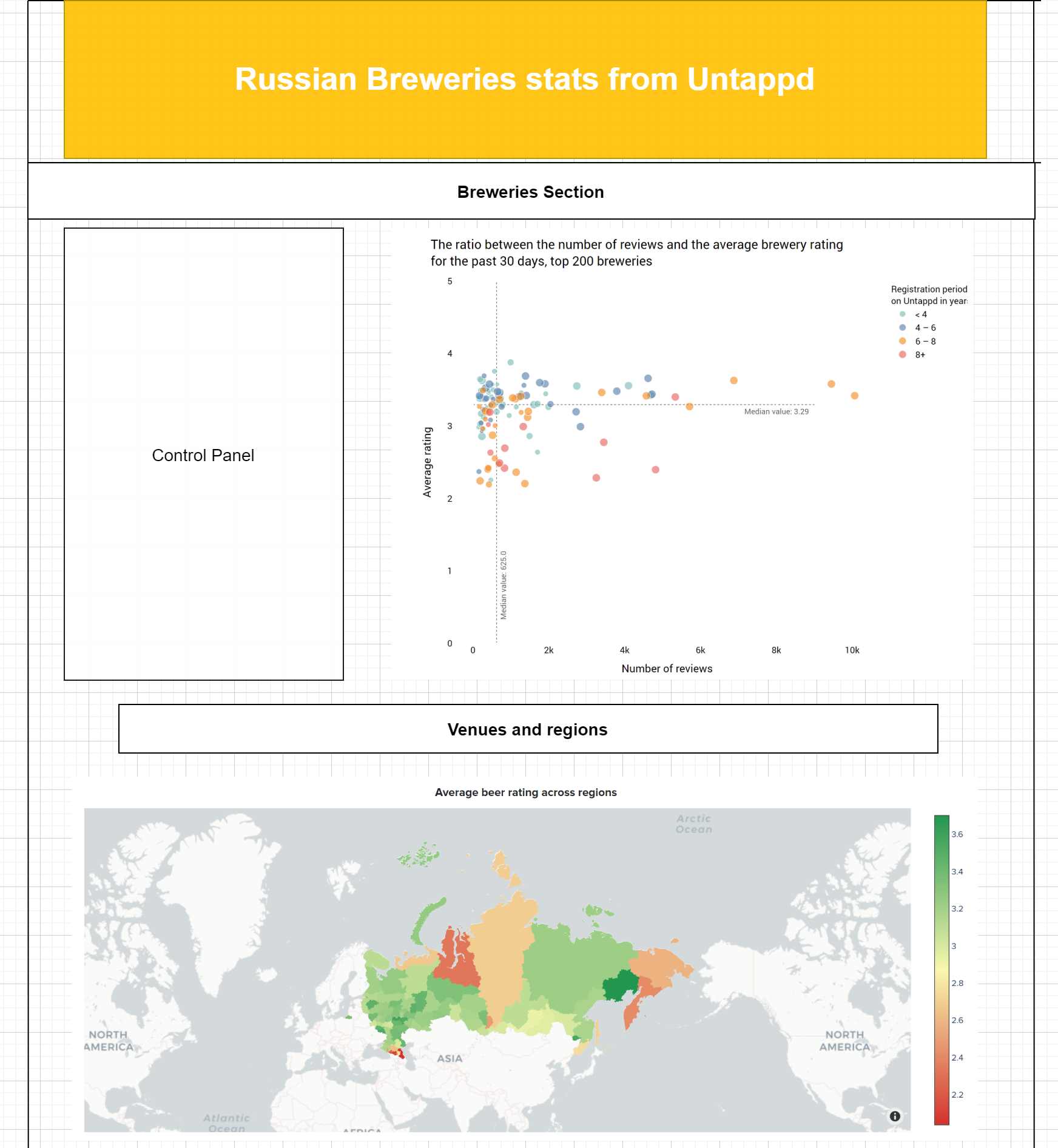
Like the dashboard itself, the top header will be colored in gold and white, the main colors of Untappd. Just below the header, there is a section with breweries, which includes a scatter plot and a control panel. And at the bottom of the page, there will be a map showing beverage rating across the regions of Russia.

All right, let’s get started, first create a new python file with the name application.py. The file will store all the front end components of the dashboard, and create a new directory named assets. The directory structure should be similar:

- application.py
- assets/
    |-- typography.css
    |-- header.css
    |-- custom-script.js
    |-- image.png

Then we import the libraries and initialize our application:

import dash
import dash_bootstrap_components as dbc
import dash_html_components as html
import dash_core_components as dcc
import pandas as pd
from get_ratio_scatter_plot import get_plot
from get_russian_map import get_map
from clickhouse_driver import Client
from dash.dependencies import Input, Output

standard_BS = dbc.themes.BOOTSTRAP
app = dash.Dash(__name__, external_stylesheets=[standard_BS])

Main parameters of the app:
__name__ — to enable access to static elements stored in the assets folder (such as images, CSS and JS files)
external_stylesheets — external CSS styling, here we are using a standard Bootstrap theme, however you can create your own theme or use any of  the availables ones.

Hook up a few more things to work with local files and connect to the Clickhouse Database:

app.scripts.config.serve_locally = True
app.css.config.serve_locally = True

client = Client(host='ec2-3-16-148-63.us-east-2.compute.amazonaws.com',
                user='default',
                password='',
                port='9000',
                database='default')

Add a palette of colors:

colors = ['#ffcc00', 
          '#f5f2e8', 
          '#f8f3e3',
          '#ffffff', 
          ]

Creating a layout

All the dashboard elements will be placed within a Bootstrap container, which is in the  <div> block:

- app 
    |-- div
     |-- container
      |-- logo&header
     |-- container
      |-- div
       |-- controls&scatter
       |-- map
app.layout = html.Div(
                    [
                        dbc.Container(

                                         < header>
                         
                        dbc.Container(       
                            html.Div(
                                [
                        
                                    < body >
                        
                                ],
                            ),
                            fluid=False, style={'max-width': '1300px'},
                        ),
                    ],
                    style={'background-color': colors[1], 'font-family': 'Proxima Nova Bold'},
                )

Here we set a fixed container width, background color, and font style of the page that is stored in typography.css in the assets folder. Let’s take a closer look at the first element in the div block, that’s the top header with the Untappd logo:

logo = html.Img(src=app.get_asset_url('logo.png'),
                        style={'width': "128px", 'height': "128px",
                        }, className='inline-image')

and the header:

header = html.H3("Russian breweries stats from Untappd", style={'text-transform': "uppercase"})

We used Bootstrap Forms to position these two elements on the same level.

logo_and_header = dbc.FormGroup(
        [
            logo,
            html.Div(
                [
                    header
                ],
                className="p-5"
            )
        ],
        className='form-row',
)

The class name ‘p-5’ allows to increase padding and vertically align the title while specifying ‘form-row’ as the form class name we put the logo and header in one row. At this point, the top header should look the following:

Now we need to center the elements and add some colors. Create a separate container that will take one row. Specify ‘d-flex justify-content-center’ in the className to achieve the same output.

dbc.Container(
                    dbc.Row(
                        [
                            dbc.Col(
                                html.Div(
                                    logo_and_header,
                                ),
                            ),
                        ],
                        style={'max-height': '128px',
                               'color': 'white',
                       }

                    ),
                    className='d-flex justify-content-center',
                    style={'max-width': '100%',
                           'background-color': colors[0]},
                ),

And now the top header is done:

We’re approaching the main part, create the next Bootstrap Container and add a subheading:

dbc.Container(
                    html.Div(
                        [
                            html.Br(),
                            html.H5("Breweries", style={'text-align':'center', 'text-transform': 'uppercase'}),
                            html.Hr(), # horizontal  break

The main body will consist of Bootstrap Cards, they can provide a structured layout of all parts, giving each element a clear border and saving the white space. Create the next element, a control panel with sliders:

slider_day_values = [1, 10, 20, 30, 40, 50, 60, 70, 80, 90, 100]
slider_top_breweries_values = [5, 25, 50, 75, 100, 125, 150, 175, 200]

controls = dbc.Card(
    [
       dbc.CardBody(
           [
               dbc.FormGroup(
                    [
                        dbc.Label("Time Period", style={'text-align': 'center', 'font-size': '100%', 'text-transform': 'uppercase'}),
                        dcc.Slider(
                            id='slider-day',
                            min=1,
                            max=100,
                            step=10,
                            value=100,
                            marks={i: i for i in slider_day_values}
                        ),
                    ], style={'text-align': 'center'}
               ),
               dbc.FormGroup(
                    [
                        dbc.Label("Number of breweries", style={'text-align': 'center', 'font-size': '100%', 'text-transform': 'uppercase'}),
                        dcc.Slider(
                            id='slider-top-breweries',
                            min=5,
                            max=200,
                            step=5,
                            value=200,
                            marks={i: i for i in slider_top_breweries_values}
                        ),
                    ], style={'text-align': 'center'}
               ),
           ],
       )
    ],
    style={'height': '32.7rem', 'background-color': colors[3]}
)

The control panel consists of two sliders that can be used to change the view on the scatter, they are positioned one below the other in a Bootstrap Form. The sliders were put inside the dbc.CardBody block, other elements will be added in the same way. It allows to eliminate alignment problem and achieve clear borders. By default, the sliders are painted in blue, but we can easily customize them by changing the properties of the class in sliders.css. Add the control panel with the scatter plot as follows:

dbc.Row(
                [
                    dbc.Col(controls, width={"size": 4,
                                     "order": 'first',
                                             "offset": 0},
                     ),
                     dbc.Col(dbc.Card(
                                [
                                    dbc.CardBody(
                                        [
                                            html.H6("The ratio between the number of reviews and the average brewery rating",
                                                    className="card-title",
                                                    style={'text-transform': 'uppercase'}), 
                                            dcc.Graph(id='ratio-scatter-plot'),
                                        ],
                                    ),
                                ],
                                style={'background-color': colors[2], 'text-align':'center'}
                             ),
                     md=8),
                ],
                align="start",
                justify='center',
            ),
html.Br(),

And at the bottom of the page we will position the map:

html.H5("Venues and Regions", style={'text-align':'center', 'text-transform': 'uppercase',}),
                            html.Hr(), # horizontal  break
                            dbc.Row(
                                [
                                    dbc.Col(
                                        dbc.Card(
                                            [
                                                dbc.CardBody(
                                                    [
                                                        html.H6("Average beer rating across regions",
                                                                className="card-title",
                                                                style={'text-transform': 'uppercase'},
                                                        ),  
                                                        dcc.Graph(figure=get_map())
                                                    ],
                                                ),
                                            ],
                                        style={'background-color': colors[2], 'text-align': 'center'}
                                        ),
                                md=12),
                                ]
                            ),
                            html.Br(),

Callbacks in Dash

Callback functions allow making dashboard elements interactive through the  Input and Output properties of a particular component.

@app.callback(
    Output('ratio-scatter-plot', 'figure'),
    [Input('slider-day', 'value'),
     Input('slider-top-breweries', 'value'),
     ]
)
def get_scatter_plots(n_days=100, top_n=200):
    if n_days == 100 and top_n == 200:
        df = pd.read_csv('data/ratio_scatter_plot.csv')
        return get_plot(n_days, top_n, df)
    else:
        return get_plot(n_days, top_n)

In this example, our inputs are the “value” properties of the components that have the ids “slider-day’” and  “slider-top-breweries”. Our output is the “children” property of the component with the id “ratio-scatter-plot”. When the input values are changed, the decorator function will be called automatically and the output on the scatter is updated. Learn more about callbacks from the examples in the docs.
It’s worth noting, that the scatter plot may not be displayed correctly when the page is loaded. To avoid this scenario we need to specify its initial state and produce a scatter plot from the saved CSV file stored in the data folder. Then, when changing the slider values, all data will be taken directly from the Clickhouse tables.

Add a few more lines responsible for deployment and our app is ready to run:

application = app.server

if __name__ == '__main__':
    application.run(debug=True, port=8000)

Next, we need to  deploy our app to AWS BeansTalk and the first part of our Bootstrap Dashboard is completed:

Thanks for reading the first part of our series about Bootstrap Dashboards, in the next one we are going to add more new components, improved callbacks, and talk about tables in Bootstrap.

View the code on Github

 No comments    1325   2020   bootstrap   dash   data analytics   untappd

Building a Plotly Dashboard with dynamic sliders in Python

Время чтения текста – 2 минуты

Recently we discussed how to use Plotly and built a scatter plot to display the ratio between the number of reviews and the average rating for Russian Breweries registered on Untappd. Each marker on the plot has two properties, the registration period and the beer range. And today we are going to introduce you to Dash, a Python framework for building analytical web applications. First, create a new file name app.py with a get_scatter_plot(n_days, top_n) function from the previous article.

import dash
import dash_core_components as dcc
import dash_html_components as html
from get_plots import get_scatter_plot

After importing the necessary libraries we need to load CSS styles and initiate our web app:

external_stylesheets = ['https://codepen.io/chriddyp/pen/bWLwgP.css']
app = dash.Dash(__name__, external_stylesheets=external_stylesheets)

Create a dashboard structure:

app.layout = html.Div(children=[
       html.Div([
           dcc.Graph(id='fig1'),
       ]) ,
       html.Div([
           html.H6('Time period (days)'),
           dcc.Slider(
               id='slider-day1',
               min=0,
               max=100,
               step=1,
               value=30,
               marks={i: str(i) for i in range(0, 100, 10)}
           ),
           html.H6('Number of breweries from the top'),
           dcc.Slider(
               id='slider-top1',
               min=0,
               max=500,
               step=50,
               value=500,
               marks={i: str(i) for i in range(0, 500, 50)})
       ])
])

Now we have a plot and two sliders, each with its id and parameters: minimum value, maximum value, step, and initial value. Since the sliders data will be displayed in the plot we need to create a callback. Output is the first argument that displays our plot, the following Input parameters accept values on which the plot depends.

@app.callback(
   dash.dependencies.Output('fig1', 'figure'),
   [dash.dependencies.Input('slider-day1', 'value'),
    dash.dependencies.Input('slider-top1', 'value')])
def output_fig(n_days, top_n):
    get_scatter_plot(n_days, top_n)

At the end of our script we will add the following line to run our code :

if __name__ == '__main__':
   app.run_server(debug=True)

Now, whenever the script is running our local IP address will be displayed in the terminal. Let’s open it in a web browser to view our interactive dashboard, it’s updated automatically when moving the sliders.

 No comments    793   2020   dash   data analytics   plotly   python   untappd

Building a scatter plot for Untappd Breweries

Время чтения текста – 7 минут

Today we are going to build a scatter plot for Russian Breweries that would display the ratio between the number of reviews and their average ratings for the past 30 days. Data will be taken from check-ins left by Untappd users who rated beers. To make a plot we need markers with specified color and size. The color will depend on a brewery registration date, thus displaying it’s registration period on Untappd, while the size of a marker correlates with the range of beers represented. This article is the first part of our series dedicated to building dashboards with Plotly.

Writing a Clickhouse query

First, we need to process the data before using it in our dashboard. Here, we are using public data collected from Untappd. You can find more about this in our previous articles: Handling website buttons in Selenium and Example of using dictionaries in Clickhouse with Untappd.

from datetime import datetime, timedelta
from clickhouse_driver import Client
import plotly.graph_objects as go
import pandas as pd
import numpy as np
client = Client(host='ec1-2-34-567-89.us-east-2.compute.amazonaws.com', user='default', password='', port='9000', database='default')

Our scatter plot will depend on the  get_scatter_plot(n_days, top_n) function, which takes two arguments denoting a time span and a number of breweries to display. Let’s write a SQL query to calculate the Brewery Pure Average. It can be presented the following: multiply the beer rating by the total number of ratings and divide it by the number of brewery reviews. We will also pass a brewery name and its beer range to the query, these parameters can be fetched from our dictionary using the  dictGet function. We are only interested in those breweries that have Brewery Pure Average > 0 and the number of reviews > 100.

brewery_pure_average = client.execute(f"""
SELECT
       t1.brewery_id,
       sum(t1.beer_pure_average_mult_count / t2.count_for_that_brewery) AS brewery_pure_average,
       t2.count_for_that_brewery,
       dictGet('breweries', 'brewery_name', toUInt64(t1.brewery_id)),
       dictGet('breweries', 'beer_count', toUInt64(t1.brewery_id)),
       t3.stats_age_on_service / 365
   FROM
   (
       SELECT
           beer_id,
           brewery_id,
           sum(rating_score) AS beer_pure_average_mult_count
       FROM beer_reviews
       WHERE created_at >= today()-{n_days}
       GROUP BY
           beer_id,
           brewery_id
   ) AS t1
   ANY LEFT JOIN
   (
       SELECT
           brewery_id,
           count(rating_score) AS count_for_that_brewery
       FROM beer_reviews
       WHERE created_at >= today()-{n_days}
       GROUP BY brewery_id
   ) AS t2 ON t1.brewery_id = t2.brewery_id
   ANY LEFT JOIN
   (
       SELECT
           brewery_id,
           stats_age_on_service
       FROM brewery_info
   ) AS t3 ON t1.brewery_id = t3.brewery_id
   GROUP BY
       t1.brewery_id,
       t2.count_for_that_brewery,
       t3.stats_age_on_service
   HAVING t2.count_for_that_brewery >= 150
   ORDER BY brewery_pure_average
   LIMIT {top_n}
    """)

scatter_plot_df_with_age = pd.DataFrame(brewery_pure_average, columns=['brewery_id', 'brewery_pure_average', 'rating_count', 'brewery_name', 'beer_count'])

Working with a DataFrame

Add two dotted lines that will pass through the median values of each axis. That way we can find out which breweries are above average, the best ones will be in the upper right area.

dict_list = []
dict_list.append(dict(type="line",
                     line=dict(
                         color="#666666",
                         dash="dot"),
                     x0=0,
                     y0=np.median(scatter_plot_df_with_age.brewery_pure_average),
                     x1=7000,
                     y1=np.median(scatter_plot_df_with_age.brewery_pure_average),
                     line_width=1,
                     layer="below"))
dict_list.append(dict(type="line",
                     line=dict(
                         color="#666666",
                         dash="dot"),
                     x0=np.median(scatter_plot_df_with_age.rating_count),
                     y0=0,
                     x1=np.median(scatter_plot_df_with_age.rating_count),
                     y1=5,
                     line_width=1,
                     layer="below"))

Add annotations to display median values by hovering:

annotations_list = []
annotations_list.append(
    dict(
        x=8000,
        y=np.median(scatter_plot_df_with_age.brewery_pure_average) - 0.1,
        xref="x",
        yref="y",
        text=f"Median value: {round(np.median(scatter_plot_df_with_age.brewery_pure_average), 2)}",
        showarrow=False,
        font={
            'family':'Roboto, light',
            'color':'#666666',
            'size':12
        }
    )
)
annotations_list.append(
    dict(
        x=np.median(scatter_plot_df_with_age.rating_count) + 180,
        y=0.8,
        xref="x",
        yref="y",
        text=f"Median value: {round(np.median(scatter_plot_df_with_age.rating_count), 2)}",
        showarrow=False,
        font={
            'family':'Roboto, light',
            'color':'#666666',
            'size':12
        },
        textangle=-90
    )
)

Let’s make our plot more informative by splitting breweries into 4 groups according to the beer range. The first group will include breweries with less than 10 brands, the second group for those holding 10-30 brands, the third one for 30-50 brands, and the last one for large breweries with >50 brands. We stored marker sizes in the bucket_beer_count list.

bucket_beer_count = []
for beer_count in scatter_plot_df_with_age.beer_count:
   if beer_count < 10:
       bucket_beer_count.append(7)
   elif 10 <= beer_count <= 30:
       bucket_beer_count.append(9)
   elif 31 <= beer_count <= 50:
       bucket_beer_count.append(11)
   else:
       bucket_beer_count.append(13)
scatter_plot_df_with_age['bucket_beer_count'] = bucket_beer_count

Next step is to perform age-based splitting

bucket_age = []
for age in scatter_plot_df_with_age.age_on_service:
   if age < 4:
       bucket_age.append(0)
   elif 4 <= age <= 6:
       bucket_age.append(1)
   elif 6 < age < 8:
       bucket_age.append(2)
   else:
       bucket_age.append(3)
scatter_plot_df_with_age['bucket_age'] = bucket_age

Let’s divide our DataFrame into 4 parts to build separate scatter plots with its own color and size.

scatter_plot_df_0 = scatter_plot_df[scatter_plot_df.bucket == 0]
scatter_plot_df_1 = scatter_plot_df[scatter_plot_df.bucket == 1]
scatter_plot_df_2 = scatter_plot_df[scatter_plot_df.bucket == 2]
scatter_plot_df_3 = scatter_plot_df[scatter_plot_df.bucket == 3]

Plotting

Now we are ready to build the plot, add our 4 brewery groups one by one, setting its key parameters: name, marker color, annotation transparency and text.

fig = go.Figure()
fig.add_trace(go.Scatter(
    x=scatter_plot_df_0.rating_count,
    y=scatter_plot_df_0.brewery_pure_average,
    name='< 4',
    mode='markers',
    opacity=0.85,
    text=scatter_plot_df_0.name_count,
    marker_color='rgb(114, 183, 178)',
    marker_size=scatter_plot_df_0.bucket_beer_count,
    textfont={"family":"Roboto, light",
              "color":"black"
             }
))

fig.add_trace(go.Scatter(
    x=scatter_plot_df_1.rating_count,
    y=scatter_plot_df_1.brewery_pure_average,
    name='4 – 6',
    mode='markers',
    opacity=0.85,
    marker_color='rgb(76, 120, 168)',
    text=scatter_plot_df_1.name_count,
    marker_size=scatter_plot_df_1.bucket_beer_count,
    textfont={"family":"Roboto, light",
              "color":"black"
             }
))

fig.add_trace(go.Scatter(
    x=scatter_plot_df_2.rating_count,
    y=scatter_plot_df_2.brewery_pure_average,
    name='6 – 8',
    mode='markers',
    opacity=0.85,
    marker_color='rgb(245, 133, 23)',
    text=scatter_plot_df_2.name_count,
    marker_size=scatter_plot_df_2.bucket_beer_count,
    textfont={"family":"Roboto, light",
              "color":"black"
             }
))

fig.add_trace(go.Scatter(
    x=scatter_plot_df_3.rating_count,
    y=scatter_plot_df_3.brewery_pure_average,
    name='8+',
    mode='markers',
    opacity=0.85,
    marker_color='rgb(228, 87, 86)',
    text=scatter_plot_df_3.name_count,
    marker_size=scatter_plot_df_3.bucket_beer_count,
    textfont={"family":"Roboto, light",
              "color":"black"
             }
))

fig.update_layout(
    title=f"The ratio between the number of reviews and the average brewery rating for the past <br> {n_days} days, top {top_n} breweries",
    font={
            'family':'Roboto, light',
            'color':'black',
            'size':14
        },
    plot_bgcolor='rgba(0,0,0,0)',
    yaxis_title="Average rating",
    xaxis_title="Number of reviews",
    legend_title_text='Registration period<br> on Untappd in years:',
    height=750,
    shapes=dict_list,
    annotations=annotations_list
)

Voila, the scatter plot is done! Each point is a separate brewery. The color shows the brewery beer range and when hovering we will see a summary including the average rating for the past 30 days, number of reviews, brewery name, and beer range. The dotted lines are passing through the median values we calculated with NumPy, they’re showing us the best breweries in the upper right. In our next article, we are going to create a breweries dashboard with dynamic parameters.

 No comments    529   2020   dash   plotly   python   untappd