3 posts tagged

pandas

Mean VS median: how to choose a target metric?

Время чтения текста – 8 минут

In today’s article, we would like to highlight a simple, but important topic – how to choose a simple metric to evaluate a particular dataset. Everyone has been familiar with the arithmetic mean for a long time, almost every student knows very well that you should sum up all the available values, divide by their number and get the average value. However, school knowledge does not include any alternative options, of which, in fact, there are many in statistics – almost for every occasion. In solving research and marketing problems, people often take mean as a target. Is this legitimate or is there a better option? Let’s figure it out.

To begin with, it is worth remembering the definitions of the two metrics that we will talk about today.
Mean is the most popular statistic used to calculate a data center. What is the median? Median is a value that splits data, sorted in order of increasing values, into two equal parts. This means that the median shows the central value in the sample if the number of cases is odd and the arithmetic mean of the two values ​​if the number of cases in the sample is even.

Research tasks

So, the estimation of the sample mean is often important in many research questions. For instance, specialists studying demography often study changes in the number of regions in Russia in order to track the dynamics and reflect it in reports. Let’s try to calculate the average size of the Russian city, as well as the median, and then compare the results.
First, you need to find and load data by connecting the pandas library for this.

import pandas as pd
city = pd.read_csv('city.csv', sep = ';')

Then, you need to calculate the mean and median of the sample.

mean_pop = round (city.population_2020.mean (), 0)
median_pop = round (city.population_2020.median (), 0)

The values, of course, are different, since the distribution of observations in the sample is different from the normal one. In order to understand whether they are very different, let’s build a distribution graph and display the mean and median.

import matplotlib.pyplot as plt
import seaborn as sns

sns.set_palette('rainbow')
fig = plt.figure(figsize = (20, 15))
ax = fig.add_subplot(1, 1, 1)
g = sns.histplot(data = city, x= 'population_2020', alpha=0.6, bins = 100, ax=ax)

g.axvline(mean_pop, linewidth=2, color='r', alpha=0.9, linestyle='--', label = 'Mean = {:,.0f}'.format(mean_pop).replace(',', ' '))
g.axvline(median_pop, linewidth=2, color='darkgreen', alpha=0.9, linestyle='--', label = 'Median = {:,.0f}'.format(median_pop).replace(',', ' '))

plt.ticklabel_format(axis='x', style='plain')
plt.xlabel("Population", fontsize=20)
plt.ylabel("Number of cities", fontsize=20)
plt.title("Distribution of population of russian cities", fontsize=20)
plt.legend(fontsize="xx-large")
plt.show()

Also, on this data it is worth building a boxplot for more accurate visualization with the main distribution quantiles, median, mean and outliers.

fig = plt.figure(figsize = (10, 10))
sns.set_theme(style="whitegrid")
sns.set_palette(palette="pastel")

sns.boxplot(y = city['population_2020'], showfliers = False)

plt.scatter(0, 550100, marker='*', s=100, color = 'black', label = 'Outlier')
plt.scatter(0, 560200, marker='*', s=100, color = 'black')
plt.scatter(0, 570300, marker='*', s=100, color = 'black')
plt.scatter(0, mean_pop, marker='o', s=100, color = 'red', edgecolors = 'black', label = 'Mean')
plt.legend()

plt.ylabel("Population", fontsize=15)
plt.ticklabel_format(axis='y', style='plain')
plt.title("Boxplot of population of russian cities", fontsize=15)
plt.show()

It follows from the graphs that the median is significantly less than the average, and it is also clear that this is a consequence of the presence of outliers which are Moscow and St. Petersburg. Since the arithmetic mean is an extremely sensitive metric to outliers, it is not worth relying on conclusions about the mean if they are present in the sample. An increase or decrease in the population of Moscow can greatly change the average population in Russia, but this will not affect the real regional trend.
Using the arithmetic mean, we say that the number of a typical (average) city in the Russian Federation is 268 thousand people. However, this misleads us, since the mean value is significantly higher than the median solely due to the size of the population of Moscow and St. Petersburg. In fact, the number of a typical Russian city is significantly less (2 times less!) and is approximately 104 thousand citizens.

Marketing tasks

In a business tasks, the difference between the mean and the median is also important, as using the wrong metric can seriously affect the results of the advertising campaign or make it difficult to achieve the goal. Let’s take a look at a real example of the difficulties an entrepreneur can face in retail if he chooses the wrong target metric.
To begin with, as in the previous example, let’s load a dataset about supermarket purchases. Let’s select the dataset columns necessary for analysis and rename them to simplify the code in the future. Since this data is not as well prepared as the previous ones, it is necessary to group all purchased items by receipts. In this case, it is necessary to group by two variables: by the customer’s id and by the date of purchase (the date and time is determined by the moment of closing the bill, therefore, all purchases within one bill coincide by date variable). Then, let’s name the resulting column “total_bill”, that is, the check amount and calculate the average and median.

df = pd.read_excel ('invoice_data.xlsx')
df.columns = ['user', 'total_price', 'date']
groupped_df = pd.DataFrame (df.groupby (['user', 'date']). total_price.sum ())
groupped_df.columns = ['total_bill']
mean_bill = groupped_df.total_bill.mean ()
median_bill = groupped_df.total_bill.median ()

Now, as in the previous example, you need to plot the distribution of customer checks and boxplot, and also display the median and mean on each of them.

sns.set_palette('rainbow')
fig = plt.figure(figsize = (20, 15))
ax = fig.add_subplot(1, 1, 1)
sns.histplot(groupped_df, x = 'total_bill', binwidth=200, alpha=0.6, ax=ax)
plt.xlabel("Purchases", fontsize=20)
plt.ylabel("Total bill", fontsize=20)
plt.title("Distribution of total bills", fontsize=20)
plt.axvline(mean_bill, linewidth=2, color='r', alpha=1, linestyle='--', label = 'Mean = {:.0f}'.format(mean_bill))
plt.axvline(median_bill, linewidth=2, color='darkgreen', alpha=1, linestyle='--', label = 'Median = {:.0f}'.format(median_bill))
plt.legend(fontsize="xx-large")
plt.show()
fig = plt.figure(figsize = (10, 10))
sns.set_theme(style="whitegrid")
sns.set_palette(palette="pastel")

sns.boxplot(y = groupped_df['total_bill'], showfliers = False)

plt.scatter(0, 1800, marker='*', s=100, color = 'black', label = 'Outlier')
plt.scatter(0, 1850, marker='*', s=100, color = 'black')
plt.scatter(0, 1900, marker='*', s=100, color = 'black')
plt.scatter(0, mean_bill, marker='o', s=100, color = 'red', edgecolors = 'black', label = 'Mean')
plt.legend()

plt.ticklabel_format(axis='y', style='plain')
plt.ylabel("Total bill", fontsize=15)
plt.title("Boxplot of total bills", fontsize=15)
plt.show()

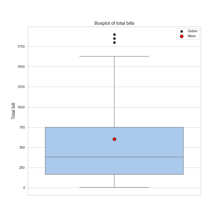
The graphs show that the distribution is different from normal, which means that the median and mean are not equal. The median value is smaller than the average by about 220 rubles.
Now, imagine that marketers have a task to increase the average buyer’s bill. A marketer may decide that since the average check is 601 rubles, the following promotion can be offered: “All buyers who make a purchase over 600 rubles, will get 20% discount on any good for 100 rubles.” In general, it is a reasonable offer, however, in reality, the average check is lower – 378 rubles. Thus, the majority of buyers will not be interested in the offer, since their purchase usually does not reach the proposed threshold. This means, that they will not take advantage of the offer and will not receive a discount, and the company will not be able to achieve its goal and increase the profit. The point is that the initial assumptions were wrong.

Conclusions

As you already understood, the mean often shows a more pleasant result, both for business and for research tasks, because it is always nicer to imagine the situation with the average check or the demographic situation in the country better than it really is. However, one must always remember about the shortcomings of mean in order to be able to correctly choose the appropriate analogue for assessing a particular situation.

 No comments    355   2021   analysis   matplotlib   pandas   python

Pandas Profiling in action: reviewing a new EDA library on Superstore Sales dataset

Время чтения текста – 8 минут

Before moving directly to data analysis we need to understand what type of data we are going to work with. In today’s material, we will take a closer look at the SuperStore Sales dataset, specifically at the Orders column. It includes customer shopping data of a Canadian online supermarket, such as order, product and customer ids, type of shipping, prices, product categories, names and etc. You can find more information about this dataset on GitHub. After creating a pandas DataFrame we can simply use the describe() method to get a sense of our data.

import pandas as pd

df = pd.read_csv('superstore_sales_orders.csv', decimal=',')
df.describe(include='all')

And oftentimes it leads to such a mess:

The source code of this library is available on GitHub

If we spend some time trying to get a grasp of this descriptive table, we can find out that customers are more likely to choose “Regular air” as a shipping type or that the majority of orders were made from Ontario. Nevertheless, there is a better tool to describe the dataset in more detail  – the pandas-profiling library. Just pass a DataFrame to it and we will get a generated HTML page with a detailed description of our dataset:

import pandas_profiling
profile = pandas_profiling.ProfileReport(df)
profile.to_file("output.html")

As you see, it returned a page with 6 sections, namely: overview, variables, interactions and correlations, number of missing values, and dataset samples.

View a full version of the Pandas Profiling Report

Data overview

Let’s move to the first subsection called “Overview”. Pandas Profiling provided the following stats: number of variables, number of observations, missing cells, duplicates, and file size. The  Variable types column shows that our DataFrame consists of 12 categorical and 9 numerical variables.

The  “Reproduction” subsection stores technical information, showing how long it took to analyze the dataset, currently installed version , configuration info and etc.

The  “Warnings” subsection informs about possible issues in the dataset structure. Now, it warns us that the “Order Date” column has too many distinct values.

Variables

Moving further, this subsection contains a detailed description of each variable, displaying the number of duplicates and missing values stored, memory size, maximum and minimal values. Right next to the stats you can see the distribution of column values.

Clicking on  Toggle details you will see more expanded information: quartiles, median and other useful descriptive statistical indicators. The remaining tabs contain a histogram displayed on the main screen, top 10 frequent values and extremes.

Interactions

This section displays how variables are interconnected on a hexbin plot: The graph looks not very obvious and clear, since the legend is lacking.

Correlations

The section represents correlations between variables calculated in a variety of ways. For example, the first tab shows Pearson’s r-value. It is noticeable that Profit is positively correlated with Sales. You can get a detailed explanation to each coefficient by clicking on the Toggle correlation descriptions button.

Missing values

This section includes a bar chart, matrix, and dendrogram with the number of fields in each variable. For instance, the  Product Base Margin column is missing three values.

Samples

And the final section show the first and last 10 rows as chunks of a dataset, pretty similar to the  head() method in Pandas.

Key Takeaways

The library is definitely more focused on statistics than Pandas, one can get useful descriptive stats for each variable and see their correlation. It provides a comprehensive report on a dataset in a user-friendly way, allowing to undertake an initial investigation and get a sense of data.
Still, the library has its shortfalls. If your dataset is fairly large the report generation time may be extended up to several hours. It’s a great tool for automating EDA tasks, however, it can’t do all the work for you and some details may be overlooked. If you are just getting started with data analysis, we would highly recommend to start it with pandas. It will solidify your knowledge and boost confidence in working with data.

 No comments    350   2020   BI-tools   pandas   pandas-profiling   python   visualisation

Collecting data from hypermarket receipts on Python

Время чтения текста – 6 минут

Recently, once again buying products in a hypermarket, I recalled that, according to the Russian Federal Act FZ-54, any trade operator, that issues a receipt, is obliged to send the data thereof to the Tax Service.

Receipt from “Lenta” hypermarket. The QR-code of our interest is circled.

So, what does it mean for us, data analysts? It means that we can know ourselves and our needs better, and also acquire interesting data on own purchases.

Let’s try to assemble a small prototype of an app that will allow to make a dynamic of our purchases within the framework of blog posts’ series. So, we’ll start from the fact, that each receipt has a QR-code, and if you identify it, you’ll receive the following line:

t=20190320T2303&s=5803.00&fn=9251440300007971&i=141637&fp=4087570038&n=1

This line comprises:

t – timestamp, the time when you made a purchase
s – sum of the receipt
fn – code number of fss, will be needed further in a request to API
i – receipt number, will be needed further in a request to API
fp – fiscalsign parameter, will be needed further in a request to API

Within the solution of the first step, we will parse the receipt data and collect it in pandas dataframe, using Python modules.

We will use API, that provides data on the receipt from the Tax Service website.

Initially, we will receive authentication data:

import requests
your_phone = '+7XXXYYYZZZZ' #you need to state your phone number, SMS with password will arrive thereon
r = requests.post('https://proverkacheka.nalog.ru:9999/v1/mobile/users/signup', json = {"email":"email@email.com","name":"USERNAME","phone":your_phone})

As a result of performing POST request we receive a password in SMS to the indicated phone number. Further on, we will be using it in a variable pwd

Now we’ll parse our line with values from QR-code:

import re
qr_string='t=20190320T2303&s=5803.00&fn=9251440300007971&i=141637&fp=4087570038&n=1'
t=re.findall(r't=(\w+)', qr_string)[0]
s=re.findall(r's=(\w+)', qr_string)[0]
fn=re.findall(r'fn=(\w+)', qr_string)[0]
i=re.findall(r'i=(\w+)', qr_string)[0]
fp=re.findall(r'fp=(\w+)', qr_string)[0]

We’ll use the variables obtained in order to extract the data.
One Habr post pretty thoroughly examines status of errors at formation of API request, therefore I won’t repeat this information.

In the beginning, we need to verify the presence of data on this receipt, so we form a GET request.

headers = {'Device-Id':'', 'Device-OS':''}
payload = {'fiscalSign': fp, 'date': t,'sum':s}
check_request=requests.get('https://proverkacheka.nalog.ru:9999/v1/ofds/*/inns/*/fss/'+fn+'/operations/1/tickets/'+i,params=payload, headers=headers,auth=(your_phone, pwd))
print(check_request.status_code)

In the request one needs to indicate headers, at least empty ones. In my case, GET request returns error 406, thus I get that such receipt is found (why GET request returns 406 remains a mystery to me, so I will be glad to receive some clues in comments). If not indicating sum or date, GET request returns error 400 – bad request.

Let’s move on to the most interesting part, receiving data of the receipt:

request_info=requests.get('https://proverkacheka.nalog.ru:9999/v1/inns/*/kkts/*/fss/'+fn+'/tickets/'+i+'?fiscalSign='+fp+'&sendToEmail=no',headers=headers,auth=(your_phone, pwd))
print(request_info.status_code)
products=request_info.json()

We should receive code 200 (successful execution of the request), and in the variable products – everything, that applies to our receipt.

In order to further work with this data, let’s use pandas and transform everything in dataframe.

import pandas as pd
from datetime import datetime
my_products=pd.DataFrame(products['document']['receipt']['items'])
my_products['price']=my_products['price']/100
my_products['sum']=my_products['sum']/100
datetime_check = datetime.strptime(t, '%Y%m%dT%H%M') #((https://docs.python.org/3/library/datetime.html#strftime-and-strptime-behavior formate the date))
my_products['date']=datetime_check
my_products.set_index('date',inplace=True)

Now we have working pandas.dataframe with receipts, visually it looks as follows:

“Header” of receipt data

You can construct a bar chart of purchases or observe everything as a box plot:

import matplotlib.pyplot as plt
%matplotlib inline
my_products['sum'].plot(kind='hist', bins=20)
plt.show()
my_products['sum'].plot(kind='box')
plt.show()
boxplot_cheques.png

In conclusion, we will simply get descriptive statistics as text, using a command .describe():

my_products.describe()

It’s convenient to write down data as .csv file, so that the next time you can amend the statistics:

with open('hyper_receipts.csv', 'a') as f:
             my_products.to_csv(f, header=True)
 No comments    676   2019   analysis   data science   machine learning   pandas   python   web-crawling