11 posts tagged

visualisation

Bubble charts basics: area vs radius

Время чтения текста – 5 минут

Data visualization is a skill used in any industry where data is present, because tables are only good for storing information. When there is a need to present data, or rather certain conclusions derived from them, the data must be presented on graphs of a suitable type. So, here you are faced with two tasks: the first is to choose the right type of graph, the second is to display the results in a plausible way. Today we will tell you about one mistake that designers sometimes make when visualizing data on bubble-charts and how this mistake can be avoided.

The crux of building a bubble-chart

Firstly, let us tell you a bit of boring theory before we start analyzing the data. Bubble-chart is a convenient way to show three numerical variables without building a 3D model. The usual X and Y axes indicate the values ​​of two parameters, and the third is shown by the size of the circle that corresponds to each observation. This is what makes it possible to avoid the need to build a complex 3D chart, that is, anyone who sees a bubble-chart will be able to draw conclusions about the data much faster.

A mistake that a designer, but not a data analyst, can make

With the metrics that are displayed on the axes of the graph, no questions arise. This is the usual way of visualizing data, but with the data shown by the size of the circles there is some difficulty: how to correctly and accurately display changes in the values ​​of a variable, if the control is not a point on the axis, but the size of this point?
The fact is that when building such a graph without using analytical tools, for example, in a graphics editor, the author can draw circles, taking the radius of the circle as its size. At first glance, everything seems to be absolutely correct – the larger the value of the variable, the larger the radius of the circle. However, in this case, the area of ​​the circle will increase not as a linear, but as a power function, because S = π × r2. For instance, the figure below shows that if you double the radius of a circle, the area will quadruple.


Draw a circle in Matplotlib  

fig = plt.figure (figsize = (10, 10))
ax = fig.add_subplot (1, 1, 1)
s = 4 * 10e3


ax.scatter (100, 100, s = s, c = 'r')
ax.scatter (100, 100, s = s / 4, c = 'b')
ax.scatter (100, 100, s = 10, c = 'g')
plt.axvline (99, c = 'black')
plt.axvline (101, c = 'black')
plt.axvline (98, c = 'black')
plt.axvline (102, c = 'black')


ax.set_xticks (np.arange (95, 106, 1))
ax.grid (alpha = 1)

plt.show ()

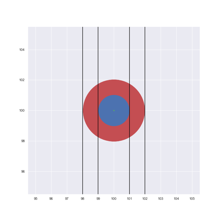
This means that the graph will look implausible, because the dimensions will not reflect the real change in the variable, and the viewer pays attention and compares exactly the area of ​​the circles on the graph.

How to build such a graph correctly?

Fortunately, if you build bubble-charts using Python libraries (Matplotlib and Seaborn), then the size of the circle will be determined by the area, which is absolutely correct from in terms of visualization.
Now, using the example of real data found on Kaggle, we will show how to build a bubble-chart. The data contains the following variables: country, population size, percentage of literate population. For the chart to be readable, let’s take a subsample of the top 10 countries after sorting all the data in order of increasing GDP.

First, let’s load all the necessary libraries:

import pandas as pd
import matplotlib.pyplot as plt
import seaborn as sns

Then, load the data, clear it from all rows with missing values ​​and transform the population of countries to millions of people:

data = pd.read_csv ('countries of the world.csv', sep = ',')
data = data.dropna ()
data = data.sort_values ​​(by = 'Population', ascending = False)
data = data.head (10)
data ['Population'] = data ['Population']. apply (lambda x: x / 1000000)

Now that all the preparations are complete, you can build a bubble-chart:

sns.set (style = "darkgrid")
fig, ax = plt.subplots (figsize = (10, 10))
g = sns.scatterplot (data = data, x = "Literacy (%)", y = "GDP ($ per capita)", size = "Population", sizes = (10,1500), alpha = 0.5)
plt.xlabel ("Literacy (Percentage of literate citizens)")
plt.ylabel ("GDP per Capita")
plt.title ('Chart with bubbles as area', fontdict = {'fontsize': 'x-large'})

def label_point (x, y, val, ax):
    a = pd.concat ({'x': x, 'y': y, 'val': val}, axis = 1)
    for i, point in a.iterrows ():
        ax.text (point ['x'], point ['y'] + 500, str (point ['val']))

label_point (data ['Literacy (%)'], data ['GDP ($ per capita)'], data ['Country'], plt.gca ())

ax.legend (loc = 'upper left', fontsize = 'medium', title = 'Population (in mln)', title_fontsize = 'large', labelspacing = 1)

plt.show ()

This graph displays three metrics in an understandable way: the level of GDP per capita on the Y axis, the percentage of the literate population on the X axis, and the population – by the area of ​​the circle.

We recommend using size of the circle to show one of the variables, if there is a need to show 3 or more variables on one chart.

 No comments    460   2021   python   visualisation

Pandas Profiling in action: reviewing a new EDA library on Superstore Sales dataset

Время чтения текста – 8 минут

Before moving directly to data analysis we need to understand what type of data we are going to work with. In today’s material, we will take a closer look at the SuperStore Sales dataset, specifically at the Orders column. It includes customer shopping data of a Canadian online supermarket, such as order, product and customer ids, type of shipping, prices, product categories, names and etc. You can find more information about this dataset on GitHub. After creating a pandas DataFrame we can simply use the describe() method to get a sense of our data.

import pandas as pd

df = pd.read_csv('superstore_sales_orders.csv', decimal=',')
df.describe(include='all')

And oftentimes it leads to such a mess:

The source code of this library is available on GitHub

If we spend some time trying to get a grasp of this descriptive table, we can find out that customers are more likely to choose “Regular air” as a shipping type or that the majority of orders were made from Ontario. Nevertheless, there is a better tool to describe the dataset in more detail  – the pandas-profiling library. Just pass a DataFrame to it and we will get a generated HTML page with a detailed description of our dataset:

import pandas_profiling
profile = pandas_profiling.ProfileReport(df)
profile.to_file("output.html")

As you see, it returned a page with 6 sections, namely: overview, variables, interactions and correlations, number of missing values, and dataset samples.

View a full version of the Pandas Profiling Report

Data overview

Let’s move to the first subsection called “Overview”. Pandas Profiling provided the following stats: number of variables, number of observations, missing cells, duplicates, and file size. The  Variable types column shows that our DataFrame consists of 12 categorical and 9 numerical variables.

The  “Reproduction” subsection stores technical information, showing how long it took to analyze the dataset, currently installed version , configuration info and etc.

The  “Warnings” subsection informs about possible issues in the dataset structure. Now, it warns us that the “Order Date” column has too many distinct values.

Variables

Moving further, this subsection contains a detailed description of each variable, displaying the number of duplicates and missing values stored, memory size, maximum and minimal values. Right next to the stats you can see the distribution of column values.

Clicking on  Toggle details you will see more expanded information: quartiles, median and other useful descriptive statistical indicators. The remaining tabs contain a histogram displayed on the main screen, top 10 frequent values and extremes.

Interactions

This section displays how variables are interconnected on a hexbin plot: The graph looks not very obvious and clear, since the legend is lacking.

Correlations

The section represents correlations between variables calculated in a variety of ways. For example, the first tab shows Pearson’s r-value. It is noticeable that Profit is positively correlated with Sales. You can get a detailed explanation to each coefficient by clicking on the Toggle correlation descriptions button.

Missing values

This section includes a bar chart, matrix, and dendrogram with the number of fields in each variable. For instance, the  Product Base Margin column is missing three values.

Samples

And the final section show the first and last 10 rows as chunks of a dataset, pretty similar to the  head() method in Pandas.

Key Takeaways

The library is definitely more focused on statistics than Pandas, one can get useful descriptive stats for each variable and see their correlation. It provides a comprehensive report on a dataset in a user-friendly way, allowing to undertake an initial investigation and get a sense of data.
Still, the library has its shortfalls. If your dataset is fairly large the report generation time may be extended up to several hours. It’s a great tool for automating EDA tasks, however, it can’t do all the work for you and some details may be overlooked. If you are just getting started with data analysis, we would highly recommend to start it with pandas. It will solidify your knowledge and boost confidence in working with data.

 No comments    350   2020   BI-tools   pandas   pandas-profiling   python   visualisation

Building an interactive waterfall chart in Python

Время чтения текста – 4 минуты

Back in 2014, we built a waterfall chart in Excel, widely known in the consulting world, for one of our presentations about the e-commerce market in Ulmart. It’s been a while and today we are going to draw one in Python and the Plotly library. This type of charts is oftentimes used to illustrate changes with the appearance of a new positive or negative factor. In the latter article about data visualization, we explained how to build a beautiful Bar Chart with bars that resemble thermometers, it’s especially useful when we want to compare planned targets with actual values.

We are using the Ulmart data on the e-commerce market growth from 2013 to 2014. Data on the X-axis is chart captions, on the Y-axis we displayed the initial and final values, as well as their change. With the sum() function calculate the total and add it to the end of our list. The <br> tag in the x_list shows a line break in text.

import plotly.graph_objects as go

x_list = ['2013','The Russian <br>Macroeconomy', 'Decline in working age<br>population','Internet usage growth','Development of<br>cross-border trade', 'National companies', '2014']
y_list = [738.5, 48.7, -7.4, 68.7, 99.7, 48.0]
total = round(sum(y_list))
y_list.append(total)

Let’s create a list with column values, we called it text_list. The values will be taken from the y_list, but first we need to transform them. Convert all numerical values into strings and if it’s not the first or the last column, add a plus sign for clarity. In case it’s a positive change, the color will be green, otherwise red. Highlight the first and the last values with the <b> tag;

text_list = []
for index, item in enumerate(y_list):
    if item > 0 and index != 0 and index != len(y_list) - 1:
        text_list.append(f'+{str(y_list[index])}')
    else:
        text_list.append(str(y_list[index]))
for index, item in enumerate(text_list):
    if item[0] == '+' and index != 0 and index != len(text_list) - 1:
        text_list[index] = '<span style="color:#2ca02c">' + text_list[index] + '</span>'
    elif item[0] == '-' and index != 0 and index != len(text_list) - 1:
        text_list[index] = '<span style="color:#d62728">' + text_list[index] + '</span>'
    if index == 0 or index == len(text_list) - 1:
        text_list[index] = '<b>' + text_list[index] + '</b>'

Let’s set parameters for the dashed lines we want to add. Create a list of dictionaries and fill it with light-gray dashed lines, passing the following:

dict_list = []
for i in range(0, 1200, 200):
    dict_list.append(dict(
            type="line",
            line=dict(
                 color="#666666",
                 dash="dot"
            ),
            x0=-0.5,
            y0=i,
            x1=6,
            y1=i,
            line_width=1,
            layer="below"))

Now, create a graph object with the Waterfall() method. Each column in our table can be of a certain type: total, absolute (both with final values) or relative (holds intermediate values). Then we need to set colors, make the connecting line transparent, positive changes will be green, while negative ones are red, and the final columns are purple. Here we are using the Open Sans font.

Learn more about how to choose the right fonts for your data visualization from this article: “Choosing Fonts for Your Data Visualization”

fig = go.Figure(go.Waterfall(
    name = "e-commerce", orientation = "v",
    measure = ["absolute", "relative", "relative", "relative", "relative", "relative", "total"],
    x = x_list,
    y = y_list,
    text = text_list,
    textposition = "outside",
    connector = {"line":{"color":'rgba(0,0,0,0)'}},
    increasing = {"marker":{"color":"#2ca02c"}},
    decreasing = {"marker":{"color":"#d62728"}},
    totals={'marker':{"color":"#9467bd"}},
    textfont={"family":"Open Sans, light",
              "color":"black"
             }
))

Finally, add the title with the description, hide the legend, set the Y label and add dashed lines to our chart.

fig.update_layout(
    title = 
        {'text':'<b>Waterfall chart</b><br><span style="color:#666666">E-commerce market growth from 2013 to 2014</span>'},
    showlegend = False,
    height=650,
    font={
        'family':'Open Sans, light',
        'color':'black',
        'size':14
    },
    plot_bgcolor='rgba(0,0,0,0)',
    yaxis_title="млрд руб.",
    shapes=dict_list
)
fig.update_xaxes(tickangle=-45, tickfont=dict(family='Open Sans, light', color='black', size=14))
fig.update_yaxes(tickangle=0, tickfont=dict(family='Open Sans, light', color='black', size=14))

fig.show()

And here it is:

 No comments    658   2020   data analytics   plotly   python   visualisation

Beautiful Bar Charts with Python and Matplotlib

Время чтения текста – 5 минут

The Matplotlib library provides a wide range of tools for Data Visualisation, allowing us to create compelling, expressive visualizations. But why then so many plots look so bland and boring? Back in 2011 we built a simple yet decent diagram for a telecommunication company report and named it ‘Thermometer’. Later this type of bars was exposed to a wide audience on  Chandoo, which was a popular blog on Excel. By the way, here’s what it looks like:

Times change, and today we’ll recall the way to plot this type of diagrams with the help of Matplotlib

When should one use this type of diagram?
The best way to plot this type of diagrams is when comparing target values with actual values because it reflects underfulfilment and overfulfilment of planned targets. A diagram may reflect data in percentages as well as in real figures. Let’s view an example using the latter.

We’ll use data stored in an excel file and already familiar python libraries for data analysis:

import numpy as np
import pandas as pd
import matplotlib.pyplot as plt

Read our file as a DataFrame:

df = pd.read_excel('data.xlsx')

That’s what it looks like:

Now, we need to extract columns from the table. The first column called «Sales» will be displayed under each bar. Some values may be of a string type if there is a comma between two values. We need to convert these type of values by replacing a comma with a dot and converting them to floats.

xticks = df.iloc[:,0]
try:
    bars2 = df.iloc[:,1].str.replace(',','.').astype('float')
except AttributeError:
    bars2 = df.iloc[:,1].astype('float')
try:
    bars1 = df.iloc[:,2].str.replace(',','.').astype('float')
except AttributeError:
    bars1 = df.iloc[:,2].astype('float')

As we don’t know for sure if the table includes such values, our actions may cause an  AttributeError . Fortunatelly for us, Python has a built-in try – except
method for handling such errors.

Let’s plot a simple side-by-side bar graph, setting a distance between two related values using a NumPy array:

barWidth = 0.2
r1 = np.arange(len(bars1))
r2 = [x + barWidth for x in r1]
 
plt.bar(r1, bars1, width=barWidth)
plt.bar(r2, bars2, width=barWidth)

And see what happens:

Obviously, this is not what we expected. Let’s try to set a different bar width to make bars overlapping each other.

barWidth1 = 0.065
barWidth2 = 0.032
x_range = np.arange(len(bars1) / 8, step=0.125)

We can plot the bars and set its coordinates, color, width, legend and signatures in advance:

plt.bar(x_range, bars1, color='#dce6f2', width=barWidth1/2, edgecolor='#c3d5e8', label='Target')
plt.bar(x_range, bars2, color='#ffc001', width=barWidth2/2, edgecolor='#c3d5e8', label='Actual Value')
for i, bar in enumerate(bars2):
    plt.text(i / 8 - 0.015, bar + 1, bar, fontsize=14)

Add some final touches – remove the frames, ticks, add a grey line under the bars, adjust font size and layout, make a plot a bit wider and save it as a .png file.

plt.xticks(x_range, xticks)
plt.tick_params(
    bottom=False,
    left=False,
    labelsize=15
)
plt.rcParams['figure.figsize'] = [25, 7]
plt.axhline(y=0, color='gray')
plt.legend(frameon=False, loc='lower center', bbox_to_anchor=(0.25, -0.3, 0.5, 0.5), prop={'size':20})
plt.box(False)
plt.savefig('plt', bbox_inches = "tight")
plt.show()

And here’s the final result:

 No comments    818   2020   data analytics   matplotlib   python   visualisation

Cohort analysis in Redash

Время чтения текста – 5 минут

In one of the previous articles we have reviewed building of Retention-report and have partially addressed the concept of cohorts therein.
Cohort usually implies group of users of a product or a company. Most often, groups are allocated on the basis of time of app installation / appearance of a user in a system.
It turns out, that, using cohort analysis, one can track down how the changes in a product affected the behaviour of users (for example, of old and new users).

Along with that, cohorts can be defined also proceeding from other parameters: geography of a user, traffic source, device platform and other important parameters of your product.

We will figure out, how to compare Retention of users of weekly cohorts in Redash, since Redash has special type of visualization for building such type of report.
Firstly, let’s sort out SQL-query. We still have two tables – user (id of a user and time of app installation) and client_session – timestamps (created_at) of activity of each user (user_id). Let’s consider the Retention of the first seven days for last 60 days.
The query is written in Cloudera Impala, let’s review it.

For starters, let’s build the total size of cohorts:

select trunc(from_unixtime(user.installed_at), "WW") AS cohort_week, 
	ndv(distinct user.id) as cohort_size //counting the number of users in the cohort
	from user 
	where from_unixtime(user.installed_at) between date_add(now(), -60) and now() //taking registered users for last 60 days
group by trunc(from_unixtime(user.installed_at), "WW")

The second part of the query can calculate the quantity of active users for every day during the first thirty days:

select trunc(from_unixtime(user.installed_at), "WW") AS cohort_week, 
        datediff(cast(cs.created_at as timestamp),cast(user.installed_at as timestamp)) as days,
	ndv(distinct user.id) as value  //counting the number of active users for every day
		from user 
		left join client_session cs on user.id=cs.user_id
where from_unixtime(user.installed_at) between date_add(now(), -60) and now()
and from_unixtime(cs.created_at) >= date_add(now(), -60) //taking sessions for last 60 days
and datediff(cast(cs.created_at as timestamp),cast(user.installed_at as timestamp)) between 0 and 30 //cutting off only the first 30 days of activity
group by 1,2

Bottom line, all the query entirely:

select size.cohort_week, size.cohort_size, ret.days, ret.value from
(select trunc(from_unixtime(user.installed_at), "WW") AS cohort_week, 
		ndv(distinct user.id) as cohort_size 
	from user 
	where from_unixtime(user.installed_at) between date_add(now(), -60) and now()
group by trunc(from_unixtime(user.installed_at), "WW")) size
left join (select trunc(from_unixtime(user.installed_at), "WW") AS cohort_week, 
        datediff(cast(cs.created_at as timestamp),cast(user.installed_at as timestamp)) as days,
		ndv(distinct user.id) as value 
		from user 
		left join client_session cs on user.id=cs.user_id
where from_unixtime(user.installed_at) between date_add(now(), -60) and now()
and from_unixtime(cs.created_at) >= date_add(now(), -60)
and datediff(cast(cs.created_at as timestamp),cast(user.installed_at as timestamp)) between 0 and 30
group by 1,2) ret on size.cohort_week=ret.cohort_week

Great, now correctly calculated data is available to us.

Data of cohorts in tabular form

Let’s create new visualization in Redash and indicate the parameters correctly:

It’s important to indicate the parameters correctly – the columns of the resulting query are compliant therewith.

Let’s make sure to indicate that we have weekly cohorts:

Voila, our visualization of cohorts is ready:

You can add filters and parameters to it and use in a dashboard

Materials on the topic

 No comments    2762   2020   BI-tools   redash   sql   visualisation
Earlier Ctrl + ↓