Later Ctrl + ↑

VIsualizing COVID-19 in Russia with Plotly

Время чтения текста – 9 минут

Maps are widely used in data visualization, it’s a great tool to display statistics for certain areas, regions, and cities. Before displaying the map we need to encode each region or any other administrative unit. Choropleth map gets divided into polygons and multipolygons with latitude and longitude coordinates. Plotly has a built-in solution for plotting choropleth map for America and Europe regions, however, Russia is not included yet. So we decided to use an existing GeoJSON file to map administrative regions of Russia and display the latest COVID-19 stats with Plotly.

from urllib.request import urlopen
import json
import requests
import pandas as pd
from selenium import webdriver
from bs4 import BeautifulSoup as bs
import plotly.graph_objects as go

Modifying GeoJSON

First, we need to download a public GeoJSON file with the boundaries for the Federal subjects of Russia. The file already contains some information, such as region names, but it’s still doesn’t fit the required format and missing region identifiers.

with urlopen('https://raw.githubusercontent.com/codeforamerica/click_that_hood/master/public/data/russia.geojson') as response:
    counties = json.load(response)

Besides that, there are slight differences in the namings. For example, Bashkortostan on стопкоронавирус.рф, the site we are going to scrape data from, it’s listed as “The Republic of Bashkortostan”, while in our GeoJSON file it’s simply named “Bashkortostan”. These differences should be eliminated to avoid possible confusion. Also, the names should start with a capital.

regions_republic_1 = ['Бурятия', 'Тыва', 'Адыгея', 'Татарстан', 'Марий Эл',
                      'Чувашия', 'Северная Осетия – Алания', 'Алтай',
                      'Дагестан', 'Ингушетия', 'Башкортостан']
regions_republic_2 = ['Удмуртская республика', 'Кабардино-Балкарская республика',
                      'Карачаево-Черкесская республика', 'Чеченская республика']
for k in range(len(counties['features'])):
    counties['features'][k]['id'] = k
    if counties['features'][k]['properties']['name'] in regions_republic_1:
        counties['features'][k]['properties']['name'] = 'Республика ' + counties['features'][k]['properties']['name']
    elif counties['features'][k]['properties']['name'] == 'Ханты-Мансийский автономный округ - Югра':
        counties['features'][k]['properties']['name'] = 'Ханты-Мансийский АО'
    elif counties['features'][k]['properties']['name'] in regions_republic_2:
        counties['features'][k]['properties']['name'] = counties['features'][k]['properties']['name'].title()

It’s time to create a DataFrame from the resulting GeoJSON file with the regions of Russia, we’ll take the identifiers and names.

region_id_list = []
regions_list = []
for k in range(len(counties['features'])):
    region_id_list.append(counties['features'][k]['id'])
    regions_list.append(counties['features'][k]['properties']['name'])
df_regions = pd.DataFrame()
df_regions['region_id'] = region_id_list
df_regions['region_name'] = regions_list

As a result, our DataFrame looks like the following:

Data Scraping

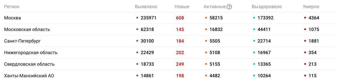
We need to scrape the data stored in this table:

Let’s use the Selenium library for this task. We need to navigate to the webpage and convert it into a BeautifulSoup object

driver = webdriver.Chrome()
driver.get('https://стопкоронавирус.рф/information/')
source_data = driver.page_source
soup = bs(source_data, 'lxml')

The region names are wrapped with <th> tags, while the latest data is stored in table cells, each one is defined with a <td> tag.

divs_data = soup.find_all('td')

The divs_data list should return something like this:

The data is grouped in one line, this includes both new cases and active ones. It is noticeable that each region corresponds to five values, for Moscow these are the first five, for Moscow Region the next five and so on. We can use this pattern to create five lists and populate with values according to the index. The first value will be appended to the list with active cases, the second value to the list of new ones, etc. After every five values, the index will be reset to zero.

count = 1
for td in divs_data:
    if count == 1:
        sick_list.append(int(td.text))
    elif count == 2:
        new_list.append(int(td.text))
    elif count == 3:
        cases_list.append(int(td.text))
    elif count == 4:
        healed_list.append(int(td.text))
    elif count == 5:
        died_list.append(int(td.text))
        count = 0
    count += 1

The next step is to extract the region names from the table, they are stored within the col-region class. We also need to clean up the data by eliminating extra white spaces and line breaks.

divs_region_names = soup.find_all('th', {'class':'col-region'})
region_names_list = []
for i in range(1, len(divs_region_names)):
    region_name = divs_region_names[i].text
    region_name = region_name.replace('\n', '').replace('  ', '')
    region_names_list.append(region_name)

Create a DataFrame:

df = pd.DataFrame()
df['region_name'] = region_names_list
df['sick'] = sick_list
df['new'] = new_list
df['cases'] = cases_list
df['healed'] = healed_list
df['died'] = died_list

After reviewing our data once again we detected white space under the index 10. This should be fixed immediately, otherwise, we may run into problems.

df.loc[10, 'region_name'] = df[df.region_name == 'Челябинская область '].region_name.item().strip(' ')

Finally, we can merge our DataFrame on the region_name column, so that the resulted table will include a column with region id, which is required to make a choropleth map.

df = df.merge(df_regions, on='region_name')

Creating a choropleth map with Plotly

Let’s create a new figure and pass a choroplethmapbox object to it. The geojson parameter will accept the counties variable with the GeoJSON file, assign the region_id to locations. The z parameter represents the data to be color-coded, in this example we’re passing the number of new cases for each region. Assign the region names to text. The colorscale parameter accepts lists with values ranging from 0 to 1 and RGB color codes. Here, the palette changes from green to yellow and then red, depending on the number of active cases. By passing the values stored in customdata we can change our hovertemplate.

fig = go.Figure(go.Choroplethmapbox(geojson=counties,
                           locations=df['region_id'],
                           z=df['new'],
                           text=df['region_name'],
                           colorscale=[[0, 'rgb(34, 150, 79)'],
                                       [0.2, 'rgb(249, 247, 174)'],
                                       [0.8, 'rgb(253, 172, 99)'],
                                       [1, 'rgb(212, 50, 44)']],
                           colorbar_thickness=20,
                           customdata=np.stack([df['cases'], df['died'], df['sick'], df['healed']], axis=-1),
                           hovertemplate='<b>%{text}</b>'+ '<br>' +
                                         'New cases: %{z}' + '<br>' +
                                         'Active cases: %{customdata[0]}' + '<br>' +
                                         'Deaths: %{customdata[1]}' + '<br>' +
                                         'Total cases: %{customdata[2]}' + '<br>' +
                                         'Recovered: %{customdata[3]}' +
                                         '<extra></extra>',
                           hoverinfo='text, z'))

Let’s customize the map, we will use a ready-to-go neutral template, called carto-positron. Set the parameters and display the map:
mapbox_zoom: responsible for zooming;
mapbox_center: centers the map;
marker_line_width: border width (we removed the borders by setting this parameter to 0);
margin: usually accepts 0 values to make the map wider.

fig.update_layout(mapbox_style="carto-positron",
                  mapbox_zoom=1, mapbox_center = {"lat": 66, "lon": 94})
fig.update_traces(marker_line_width=0)
fig.update_layout(margin={"r":0,"t":0,"l":0,"b":0})
fig.show()

And here is our map. According to the plot, we can say that the highest number of cases per day is happening in Moscow – 608 new cases. It’s really high compared to the other regions, and especially to Nenets Autonomous Okrug, where this number is surprisingly low.

View the code on GitHub

 No comments    1492   2020   dash   data analytics   plotly   python

Deploying Analytical Web App with AWS Elastic Beanstalk

Время чтения текста – 6 минут

If you need to deploy a web application and there’s an AWS EC2 Instance at hand, why not use Elastic Beanstalk? This is an AWS service that allows us to orchestrate many other ones, including EC2, S3, Simple Notification Service, CloudWatch, etc.

Setting things up

Previously, in our article “Building a Plotly Dashboard with dynamic sliders in Python” we created a project with two scripts: application.py – creates a dashboard on a local server, and get_plots.py – returns a scatter plot with Untappd breweries from Building a scatter plot for Untappd Breweries. Let’s modify the application.py script a bit to make it run with Elastic Beanstalk. Assign app.server to the application variable, it should look something like this:

application = app.server

if __name__ == '__main__':
   application.run(debug=True, port=8080)

Before deploying our app we need to create a compressed archive. This archive should contain all the necessary files, including requirements.txt that specifies what python packages are required to run the project. Just type pip freeze in your terminal window and save the output to a file:

pip freeze > requirements.txt

Now we can create a compressed archive. Unix-based systems have a built-in zip command for archiving and compression:

zip deploy_v0 application.py get_plots.py requirements.txt

Application and Environment

Navigate to  Elastic Beanstalk, click the “Applications” section and then “Create a new application”.

Fill in the necessary fields by specifying your app name and its description. After this, we are suggested to assign metadata and tag our app. The format of the tag is similar to a dictionary in Python, it’s a key-value pair, where the value of a key is unique. Once you’re ready to continue click the orange “Create’” button.

After this step, you will see a list of environments available for your app, which is initially empty. Click “ Create a new environment”

Since we are working with a web app, we need to select a web server environment:

On the next step we need to specify our environment name and also choose a domain name, if available:

Next, we select the platform for our app, which is written in Python:

Now we can upload the file with our app, click “ Upload your code” and attach the compressed file. Afterward, click “Create environment”.

You will see a terminal window with event logs. We have a couple of minutes for a coffee break.

Now our app is up and running, if you need to upload a new version, just create a new archive with updated files and click the” Upload and deploy” button again. If everything’s done right, you will see something like this:

We can switch to the site with our dashboard by following the link above. Using the  <iframe> tag our dashboard can be embedded into any other site.

<iframe id="igraph" scrolling="no" style="border:none;" seamless="seamless" src="http://dashboard1-env.eba-fvfdgmks.us-east-2.elasticbeanstalk.com/" height="1100" width="800"></iframe>

As a result, you can see the following dashboard:

View the code on Github

 No comments    871   2020   Amazon Web Services   AWS   dash   data analytics   python

Building a Plotly Dashboard with dynamic sliders in Python

Время чтения текста – 2 минуты

Recently we discussed how to use Plotly and built a scatter plot to display the ratio between the number of reviews and the average rating for Russian Breweries registered on Untappd. Each marker on the plot has two properties, the registration period and the beer range. And today we are going to introduce you to Dash, a Python framework for building analytical web applications. First, create a new file name app.py with a get_scatter_plot(n_days, top_n) function from the previous article.

import dash
import dash_core_components as dcc
import dash_html_components as html
from get_plots import get_scatter_plot

After importing the necessary libraries we need to load CSS styles and initiate our web app:

external_stylesheets = ['https://codepen.io/chriddyp/pen/bWLwgP.css']
app = dash.Dash(__name__, external_stylesheets=external_stylesheets)

Create a dashboard structure:

app.layout = html.Div(children=[
       html.Div([
           dcc.Graph(id='fig1'),
       ]) ,
       html.Div([
           html.H6('Time period (days)'),
           dcc.Slider(
               id='slider-day1',
               min=0,
               max=100,
               step=1,
               value=30,
               marks={i: str(i) for i in range(0, 100, 10)}
           ),
           html.H6('Number of breweries from the top'),
           dcc.Slider(
               id='slider-top1',
               min=0,
               max=500,
               step=50,
               value=500,
               marks={i: str(i) for i in range(0, 500, 50)})
       ])
])

Now we have a plot and two sliders, each with its id and parameters: minimum value, maximum value, step, and initial value. Since the sliders data will be displayed in the plot we need to create a callback. Output is the first argument that displays our plot, the following Input parameters accept values on which the plot depends.

@app.callback(
   dash.dependencies.Output('fig1', 'figure'),
   [dash.dependencies.Input('slider-day1', 'value'),
    dash.dependencies.Input('slider-top1', 'value')])
def output_fig(n_days, top_n):
    get_scatter_plot(n_days, top_n)

At the end of our script we will add the following line to run our code :

if __name__ == '__main__':
   app.run_server(debug=True)

Now, whenever the script is running our local IP address will be displayed in the terminal. Let’s open it in a web browser to view our interactive dashboard, it’s updated automatically when moving the sliders.

 No comments    788   2020   dash   data analytics   plotly   python   untappd

Sentiment analysis of Russians on Constitutional Amendments

Время чтения текста – 11 минут

In today’s article, we are going to use public data from vk.com to interpret and classify users’ attitudes about the 2020 amendments to the Constitution of Russia.

API Overview

First off, we need to receive data using the newsfeed.search method, this method allows us to get up to one thousand of the latest posts from the news feed by keyword.
The response data contains different fields, like post ids, user or community ids, text data, likes count, comments, apps, geolocation, and many more. We are only needed ids and text data.
Some expanded information about the author will also be useful for our analysis, this includes city, gender, age, and can be received with the users.get method.

Create Clickhouse Tables

The received data should be stored somewhere, we chose to use ClickHouse, an open-source column-oriented DBMS. Let’s create two tables to store users and their posts. The first table will be populated with ids and text data, the second one will hold user data, such as their ids, age, and city. The ReplacingMergeTree () engine will remove duplicates in our tables.

The article assumes that you’re familiar with how to install ClickHouse on AWS, create external dictionaries and  materialized views

CREATE TABLE vk_posts(
   post_id UInt64,
   post_date DateTime,
   owner_id UInt64,
   from_id UInt64,
   text String
) ENGINE ReplacingMergeTree()
ORDER BY post_date

CREATE TABLE vk_users(
   user_id UInt64,
   user_sex Nullable(UInt8),
   user_city String,
   user_age Nullable(UInt16)
) ENGINE ReplacingMergeTree()
ORDER BY user_id

Collecting user posts with the VK API

Let’s get to writing our script, import the libraries, and create several variables with constant values:

If you don’t have an access token yet and want to create one, refer to this step by step guide: “Collecting Data on Ad Campaigns from VK.com”

from clickhouse_driver import Client
from datetime import datetime
import requests
import pandas as pd
import time

token = 'your_token'
version = 5.103
client = Client(host='ec1-23-456-789-1011.us-east-2.compute.amazonaws.com', user='default', password='', port='9000', database='default')      
data_list = []
start_from = 0
query_string = 'конституция' #constitution

Define the get_and_insert_info_by_user function that will receive a list of user ids and expanded information about them, and send it to the vk_users table. Since the user_ids parameter takes a list as a string object, we need to change the structure and omit the square brackets.
Most users prefer to conceal their gender, age, and city. In such cases, we need to use Nullable values. To obtain user age we need to subtract the birth year from the current year, if the birth year is missing we can check it using the regular expression.


get_and_insert_info_by_user() function

def get_and_insert_info_by_user(users):
    try:
        r = requests.get('https://api.vk.com/method/users.get', params={
            'access_token':token,
            'v':version,
            'user_ids':str(users)[1:-2],
            'fields':'sex, city, bdate'
        }).json()['response']
        for user in r:
            user_list = []
            user_list.append(user['id'])
            if client.execute(f"SELECT count(1) FROM vk_users where user_id={user['id']}")[0][0] == 0:
                print(user['id'])
                try:
                    user_list.append(user['sex'])
                except Exception:
                    user_list.append('cast(Null as Nullable(UInt8))')
                try:
                    user_list.append(user['city']['title'])
                except Exception:
                    user_list.append('')
                try:
                    now = datetime.now()
    			    year = item.split('.')[-1]
    			    if re.match(r'\d\d\d\d', year):
        		        age = now.year - int(year)
			    	   user_list.append(age)
                except Exception:
                    user_list.append('cast(Null as Nullable(UInt16))')
                user_insert_tuple = tuple(user_list)
                client.execute(f'INSERT INTO vk_users VALUES {user_insert_tuple}')
    except KeyError:
        pass


Our script will work in a while loop to constantly update data, as we can only receive a thousand of the latest data points.The newsfeed.search method returns 200 posts per call, so we need to invoke it five times to collect all the posts.


While loop to collect new posts

while True:
    for i in range(5):
        r = requests.get('https://api.vk.com/method/newsfeed.search', params={
            'access_token':token,
            'v':version,
            'q':query_string,
            'count':200,
            'start_from': start_from
        })
        data_list.append(r.json()['response'])
        try:
            start_from = r.json()['response']['next_from']
        except KeyError:
            pass

The data we received can be parsed, VK users always have a positive id, while for communities it’s negative. We need only users data for our analysis, where from_id > 0. The next step is to check whether a post contains any text data or not. Finally, we will collect and store unique entries by user id. Pause the script after each iteration for 180 seconds to wait for new user posts and not violate the VK API rules.


Adding new data to Clickhouse

user_ids = []
    for data in data_list:
        for data_item in data['items']:
            if data_item['from_id'] > 0:
                post_list = []
                if not data_item['text']:
                    continue
                if client.execute(f"SELECT count(1) FROM vk_posts WHERE post_id={data_item['id']} AND from_id={data_item['from_id']}")[0][0] == 0:
                    user_ids.append(data_item['from_id'])
                    date = datetime.fromtimestamp(data_item['date'])
                    date = datetime.strftime(date, '%Y-%m-%d %H:%M:%S')
                    post_list.append(date)
                    post_list.append(data_item['id'])
                    post_list.append(data_item['owner_id'])
                    post_list.append(data_item['from_id'])
post_list.append(data_item['text'].replace("'","").replace('"','').replace("\n",""))
                    post_list.append(query_string)
                    post_tuple = tuple(post_list)
                    print(post_list)
                    try:
                        client.execute(f'INSERT INTO vk_posts VALUES {post_tuple}')
                    except Exception as E:
                        print('!!!!! try to insert into vk_post but got', E)
    try:
        get_and_insert_info_by_user(user_ids)
    except Exception as E:
        print("Try to insert user list:", user_ids, "but got:", E)
    time.sleep(180)

Dostoevsky for sentiment analysis

For one week our script collected almost 20000 posts from VK users that mention the keyword “constitution” (or “конституция” in Russian). It’s time to write our second script for data analysis and visualization. First, create a DataFrame with the data received, and evaluate the sentiment of each post, identifying whether it’s positive, negative, or neutral. We are going to use the Dostoevsky library to analyze the emotion behind a text.

from dostoevsky.tokenization import RegexTokenizer
from dostoevsky.models import FastTextSocialNetworkModel
from clickhouse_driver import Client
import pandas as pd
client = Client(host='ec1-23-456-789-1011.us-east-2.compute.amazonaws.com', user='default', password='', port='9000', database='default')

Assign all the contents of our table to the vk_posts variable with a simple query. Iterate through all the posts, select those with text data and populate our DataFrame.

vk_posts = client.execute('SELECT * FROM vk_posts')
list_of_posts = []
list_of_ids = []
for post in vk_posts:
    if str(post[-2]).replace(" ", ""):
        list_of_posts.append(str(post[-2]).replace("\n",""))
        list_of_ids.append(int(post[2]))
df_posts = pd.DataFrame()
df_posts['post'] = list_of_posts
df_posts['id'] = list_of_ids

Instantiate our model and iterate through the posts to evaluate the sentiment of each entry.

tokenizer = RegexTokenizer()
model = FastTextSocialNetworkModel(tokenizer=tokenizer)
sentiment_list = []
results = model.predict(list_of_posts, k=2)
for sentiment in results:
    sentiment_list.append(sentiment)

Add several boolean columns to our DataFrame that will reflect whether it’s a  positive, negative, or neutral post.

neutral_list = []
negative_list = []
positive_list = []
speech_list = []
skip_list = []
for sentiment in sentiment_list:
    neutral = sentiment.get('neutral')
    negative = sentiment.get('negative')
    positive = sentiment.get('positive')
    if neutral is None:
        neutral_list.append(0)
    else:
        neutral_list.append(sentiment.get('neutral'))
    if negative is None:
        negative_list.append(0)
    else:
        negative_list.append(sentiment.get('negative'))
    if positive is None:
        positive_list.append(0)
    else:
        positive_list.append(sentiment.get('positive'))
df_posts['neutral'] = neutral_list
df_posts['negative'] = negative_list
df_posts['positive'] = positive_list

That’s how the DataFrame looks now:

Let’s examine the most negative posts:

df_posts[df_posts.negative > 0.9]

Now, let’s add data about the authors of these posts by merging two tables together on the id column.

vk_users = client.execute('SELECT * FROM vk_users')
vk_user_ids_list = []
vk_user_sex_list = []
vk_user_city_list = []
vk_user_age_list = []
for user in vk_users:
    vk_user_ids_list.append(user[0])
    vk_user_sex_list.append(user[1])
    vk_user_city_list.append(user[2])
    vk_user_age_list.append(user[3])
df_users = pd.DataFrame()
df_users['id'] = vk_user_ids_list
df_users['sex'] = vk_user_sex_list
df_users['city'] = vk_user_city_list
df_users['age'] = vk_user_age_list
df = df_posts.merge(df_users, on='id')

And the table now looks the following:

Analysing data with Plotly

Check out our previous article on data visualization with Plotly: Building an interactive waterfall chart in Python

Let’s find the percentage of posts for each group: positive, negative, neutral. Iterate through these three columns and calculate the values more than zero for each data point. Then do the same for different age categories and gender.

According to our chart, 45% of recent user posts relevant to the keyword “constitution” have a negative meaning, while the other 52% are neutral. Later it’ll be known how different the Internet opinions from the voting results.

It’s noticeable that among the men audience the proportion of positive posts is less than 2%, while for women it’s 3.5%. However, the number of negative posts for each group is almost the same, 47% and 43% respectively.

According to our analysis, posts made by younger audiences between 18-25 years have more positive sentiment, which is 6%. While users under 18 years leave mostly negative posts, this may be because most users under the age of 18 prefer to hide their real age, this makes it difficult to obtain accurate data for such a group.
The proportion of negative posts is almost equal for all groups and accounts for 44%.
As you can see, the data is distributed equally in all three charts. This means that half of all posts relevant to the keyword “constitution” and made by VK users over the past week mostly have a negative sentiment.

 No comments    485   2020   Analytics engineering   data analytics   plotly

Building an interactive waterfall chart in Python

Время чтения текста – 4 минуты

Back in 2014, we built a waterfall chart in Excel, widely known in the consulting world, for one of our presentations about the e-commerce market in Ulmart. It’s been a while and today we are going to draw one in Python and the Plotly library. This type of charts is oftentimes used to illustrate changes with the appearance of a new positive or negative factor. In the latter article about data visualization, we explained how to build a beautiful Bar Chart with bars that resemble thermometers, it’s especially useful when we want to compare planned targets with actual values.

We are using the Ulmart data on the e-commerce market growth from 2013 to 2014. Data on the X-axis is chart captions, on the Y-axis we displayed the initial and final values, as well as their change. With the sum() function calculate the total and add it to the end of our list. The <br> tag in the x_list shows a line break in text.

import plotly.graph_objects as go

x_list = ['2013','The Russian <br>Macroeconomy', 'Decline in working age<br>population','Internet usage growth','Development of<br>cross-border trade', 'National companies', '2014']
y_list = [738.5, 48.7, -7.4, 68.7, 99.7, 48.0]
total = round(sum(y_list))
y_list.append(total)

Let’s create a list with column values, we called it text_list. The values will be taken from the y_list, but first we need to transform them. Convert all numerical values into strings and if it’s not the first or the last column, add a plus sign for clarity. In case it’s a positive change, the color will be green, otherwise red. Highlight the first and the last values with the <b> tag;

text_list = []
for index, item in enumerate(y_list):
    if item > 0 and index != 0 and index != len(y_list) - 1:
        text_list.append(f'+{str(y_list[index])}')
    else:
        text_list.append(str(y_list[index]))
for index, item in enumerate(text_list):
    if item[0] == '+' and index != 0 and index != len(text_list) - 1:
        text_list[index] = '<span style="color:#2ca02c">' + text_list[index] + '</span>'
    elif item[0] == '-' and index != 0 and index != len(text_list) - 1:
        text_list[index] = '<span style="color:#d62728">' + text_list[index] + '</span>'
    if index == 0 or index == len(text_list) - 1:
        text_list[index] = '<b>' + text_list[index] + '</b>'

Let’s set parameters for the dashed lines we want to add. Create a list of dictionaries and fill it with light-gray dashed lines, passing the following:

dict_list = []
for i in range(0, 1200, 200):
    dict_list.append(dict(
            type="line",
            line=dict(
                 color="#666666",
                 dash="dot"
            ),
            x0=-0.5,
            y0=i,
            x1=6,
            y1=i,
            line_width=1,
            layer="below"))

Now, create a graph object with the Waterfall() method. Each column in our table can be of a certain type: total, absolute (both with final values) or relative (holds intermediate values). Then we need to set colors, make the connecting line transparent, positive changes will be green, while negative ones are red, and the final columns are purple. Here we are using the Open Sans font.

Learn more about how to choose the right fonts for your data visualization from this article: “Choosing Fonts for Your Data Visualization”

fig = go.Figure(go.Waterfall(
    name = "e-commerce", orientation = "v",
    measure = ["absolute", "relative", "relative", "relative", "relative", "relative", "total"],
    x = x_list,
    y = y_list,
    text = text_list,
    textposition = "outside",
    connector = {"line":{"color":'rgba(0,0,0,0)'}},
    increasing = {"marker":{"color":"#2ca02c"}},
    decreasing = {"marker":{"color":"#d62728"}},
    totals={'marker':{"color":"#9467bd"}},
    textfont={"family":"Open Sans, light",
              "color":"black"
             }
))

Finally, add the title with the description, hide the legend, set the Y label and add dashed lines to our chart.

fig.update_layout(
    title = 
        {'text':'<b>Waterfall chart</b><br><span style="color:#666666">E-commerce market growth from 2013 to 2014</span>'},
    showlegend = False,
    height=650,
    font={
        'family':'Open Sans, light',
        'color':'black',
        'size':14
    },
    plot_bgcolor='rgba(0,0,0,0)',
    yaxis_title="млрд руб.",
    shapes=dict_list
)
fig.update_xaxes(tickangle=-45, tickfont=dict(family='Open Sans, light', color='black', size=14))
fig.update_yaxes(tickangle=0, tickfont=dict(family='Open Sans, light', color='black', size=14))

fig.show()

And here it is:

 No comments    656   2020   data analytics   plotly   python   visualisation
Earlier Ctrl + ↓